Scatter Chart
The topics in this section describe the features available in the Scatter Chart dashboard item, and explain how to create and customize scatter charts in the Web Dashboard.
Providing Data
The Web Dashboard allows you to bind various dashboard items to data in a virtually uniform manner. To learn more, see the Bind Dashboard Items to Data topic.
The only difference is in the data sections that the required dashboard item has. This topic describes how to bind a Scatter Chart dashboard item to data.
Binding to Data in the Web Dashboard
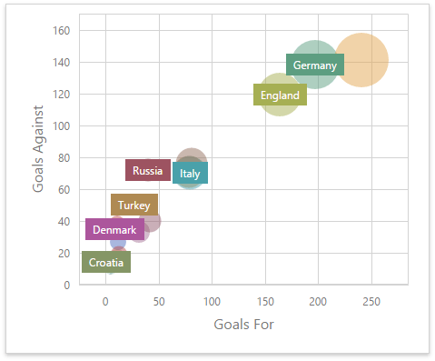
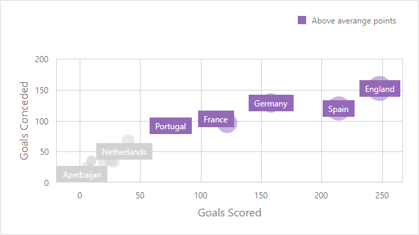
The image below shows a sample Scatter Chart dashboard item that is bound to data.
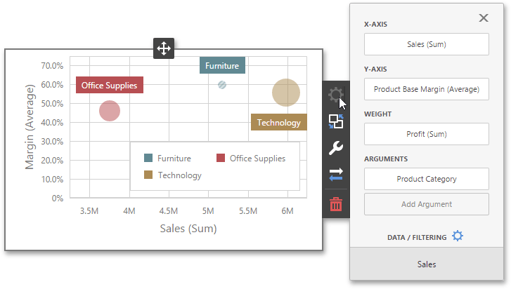
To bind the Scatter Chart dashboard item to data, click a placeholder contained in one of the available data sections and select the required data source field in the Binding section of the invoked data item menu.
The table below lists and describes the Scatter Chart’s data sections.
| Section | Processed as | Description |
|---|---|---|
| X-Axis | Measure | Contains the data item against which the X-coordinates of data points are calculated. |
| Y-Axis | Measure | Contains the data item against which the Y-coordinates of data points are calculated. |
| Weight | Measure | Contains the data item whose values are used to calculate the weight of data points. |
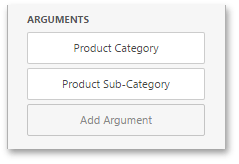
| Arguments | Dimension | Contains data items that provide scatter chart arguments used to create data points. |
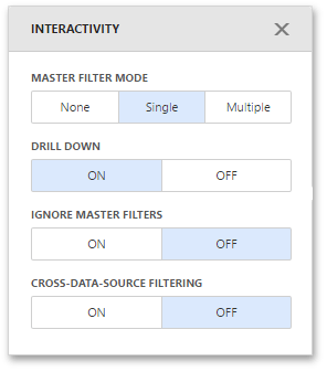
Interactivity
To enable interaction between the Scatter Chart and other dashboard items, you can use the interactivity features, as Master Filtering and Drill-Down.
Master Filtering
The Web Dashboard allows you to use any data aware dashboard item as a filter for other dashboard items. To learn more about filtering concepts common to all dashboard items, see the Master Filtering topic.
The Scatter Chart dashboard item supports filtering by points that correspond to specific argument values or their combinations.
When Master Filtering is enabled, you can click a point (or multiple points) to make other dashboard items only display data related to the selected point(s).
To enable Master Filtering, go to the Scatter Chart’s Interactivity menu and select the required Master Filtering mode.
To reset filtering, use the Clear Master Filter button (the  icon) in the Scatter Chart’s caption.
Drill-Down
The Drill-Down feature allows you to change the detail level of data displayed in dashboard items. To learn more about concepts common to all dashboard items, see the Drill-Down topic.
When drill-down is enabled, you can click a point to view the details (or double-click a point in case of enabled Master Filtering).
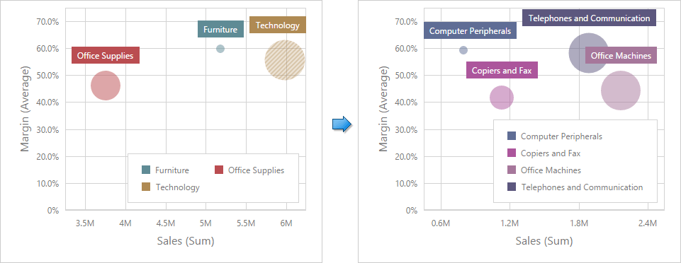
Drill-down requires that the Arguments section contains several dimensions, from the least to the most detailed dimension.
To enable Drill-Down, go to the Scatter Chart’s Interactivity menu and turn the Drill-Down option on.
To return to the previous detail level, click the Drill Up button (the  icon) in the Scatter Chart’s caption.
Legend
A legend is an element of a scatter chart that identifies chart points (for instance, colored points corresponding to argument values).
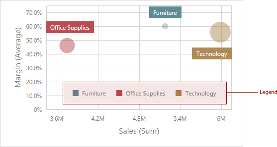
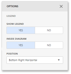
To customize legend options, go to the Scatter Chart’s Options menu and open the Legend section.
The following settings are available.
| Setting | Description |
|---|---|
| Show Legend | Specifies whether or not to show a legend. |
| Inside Diagram | Locates a legend inside or outside the Scatter Chart. |
| Position | Sets a legend position and orientation. |
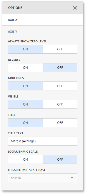
Axes
Scatter Chart X and Y-axes are numerical axis of values. You can specify various axes settings to change visual data presentation.
To access X and Y-axis settings, go to the Scatter Chart’s Options menu and open the Axis X or Axis Y section.
Here you can configure the visibility of axes, their title and grid lines, reverse the axes, etc.
The following options are available.
| Options | Description |
|---|---|
| Always show zero level | Specifies whether or not the axis’ zero level is visible. If this option is unchecked, the visible axis range is defined based on the values plotted in the chart. Note that the Axis X section does not contain the Always show zero level option. |
| Reverse | Allows you to reverse the axis. If the axis is reversed, its values are ordered from top to down. |
| Grid Lines | Allows you to hide and show grid lines for the axis. |
| Visible | Allows you to hide and show the axis. |
| Title | Allows you to hide and show the axis title. You can choose whether to use the default text or specify a custom string using the Title Text option. |
| Logarithmic scale | Specifies whether or not the axis should display its numerical values using a logarithmic scale. The combo box next to this option allows you to select the logarithmic base from one of the predefined values. |
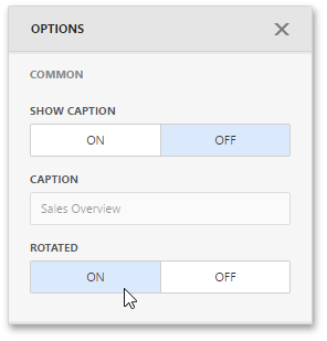
Orientation
You can rotate the Scatter Chart so that the X-axis becomes vertical, and the Y-axis becomes horizontal.
To rotate a Scatter Chart in the Web Dashboard, open the Scatter Chart’s Options menu and go to Common section. Then, turn the Rotated option on.
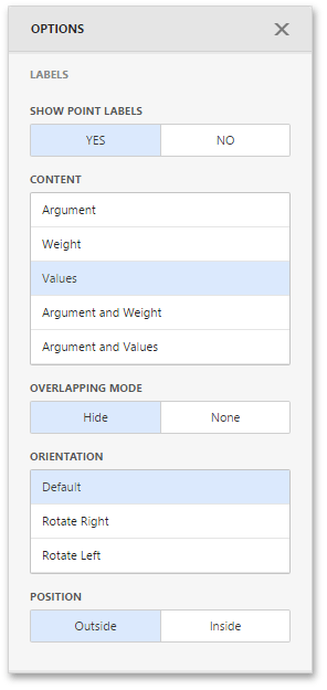
Labels
The Scatter Chart can display point labels that contain descriptions for data points, and provide tooltips with additional information.
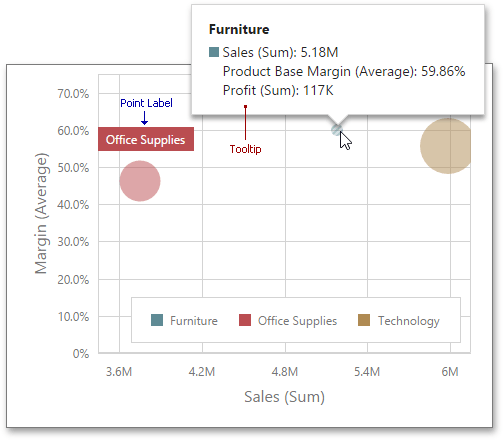
To manage the visibility of point labels, open the Scatter Chart’s Options menu and go to the Labels section. Then, turn the Show Point Labels option on.
Here you can specify the type of content displayed within point labels, configure label overlap mode and set the orientation of point labels.
The following options are available.
| Options | Description |
|---|---|
| Show Point Labels | Specifies whether or not to show point labels for the current series. |
| Content | Specifies the type of content displayed within point labels. You can select Value, Argument, Series Name or Argument and Value options. |
| Overlapping Mode | Specifies the label overlap mode. You can hide overlapping labels or disable a resolving algorithm. |
| Orientation | Specifies the orientation of point labels. You can set a default orientation or rotate point labels 90 degrees clockwise or counter clockwise. |
| Position | Specifies the position of point labels relative to bars. Point labels can be displayed inside or outside bars. |
Conditional Formatting
Use conditional formatting to highlight points in a Scatter Chart dashboard item.
Supported Format Rules
You can use the following data in rule calculations:
- measures from the X and Y axis sections
- measures from the Weight section
- dimensions from the Arguments section
- hidden measures
Format conditions that can be applied to different data item types are as follows:
- numeric
- Value
- Top-Bottom
- Average
- Expression
- Color Ranges
- Gradient Ranges
- string
- Value (with the condition type set to Equal To, Not Equal To or Text that Contains)
- Expression
- date-time
- Value
- A Date Occurring (for dimensions with a continuous date-time group interval)
- Expression
- Color Ranges
- Gradient Ranges
Refer to the following topic for more information about format condition types: Conditional Formatting in Web Dashboard.
Create and Edit a Format Rule
You can create and edit format rules in the Conditional Formatting section that is located in the following places:
-
The dashboard item’s Options menu
-
The data item menu
Refer to the following topic for information on how to create and edit format rules: Conditional Formatting in Web Dashboard.
Format Condition Settings Specific to Scatter Charts
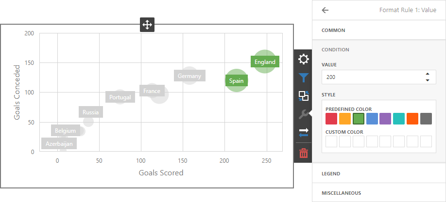
Specify appearance settings and set the condition’s value to create a format rule. Available settings depend on the selected format condition type.
The image below displays the Value rule settings. The condition colors bubbles if their weight exceeds 200.
You can apply one of the predefined colors or set a custom color for this condition.
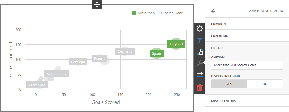
Go to the rule’s Legend section and set the Caption field to specify the legend’s text. It enables the Display in Legend option and the Scatter Chart item displays information about the applied rule in the legend.
The image below displays the Scatter Chart item with the applied Greater Than format rule. The Display in Legend option is activated and the rule’s caption is displayed in the legend:
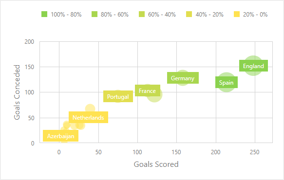
For Range format rules, the legend display text is generated automatically and depends on the range intervals:
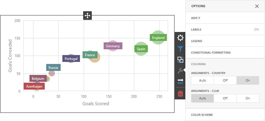
Coloring
A Scatter Chart item paints elements in pale gray if they don’t meet the applied format condition. Note that this doesn’t apply to elements that are painted by different hues.
Enable coloring for arguments to restore the color scheme:
Documentation: Web Dashboard - Coloring