A report’s advanced layout is edited in the Report Designer window. The Report Designer window consists of the following components:

-
Toolbar: the toolbar at the top of the Report Designer window provides functions to:
- save the layout (in the menu button,
 )
) - quit without saving (in the menu button)
- cut, copy, paste, and delete the selected object
- undo or redo your last action
- zoom the layout in or out
- access the scripts for the report (the
 button)
- save the layout (in the menu button,
-
Layout Area: displays the layout of the report.
-
Toolbox: the Toolbox at the left edge of the Report Designer window provides objects you can add to the layout area of the report. To add an object to the report, drag it from the Toolbox to the desired location in the layout area. See the Objects topic for information on the objects available.
-
Properties Panel: displays the properties, or settings, for the objects in a report.
-
Field List: displays the fields and parameters in the result set for the report.
To close the Report Designer, close the browser tab it appears in.
Layout Area
The Layout Area displays the layout of the report.
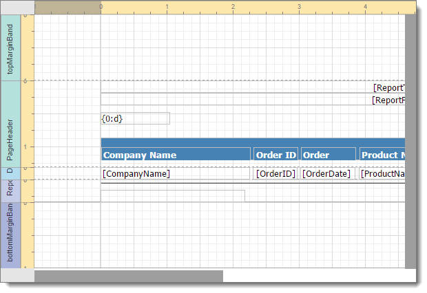
The Layout Area is organized by bands. That is, objects that appear in the report appear in one of several bands, such as the PageHeader or Detail bands. A bar showing the band name appears at the left of the Layout Area for a band. The space to the right of the bar is for the objects in that band. Click the box for a band to select the band. Click it a second time to collapse it or again to expand it. To resize a band, position your mouse pointer at the bottom of the band’s box and drag up or down. You can also change the height by editing the Height property in the Properties Panel. You cannot make a band smaller than the bottom of the lowest object in the band.
The ruler at the left is broken into sections, one for each band. There’s also a ruler at the top. In both rulers, the light-colored part shows the area on the page and the darker part shows the area off the page, including the margins.
A grid pattern is laid out over the Layout Area to help you align objects. If an object isn’t quite aligned to the grid, you can click the Align to Grid button in the Properties panel. By default, there are grid lines every 1/8 of an inch. To change the grid scale, select the report in the object list in the Property panel (it’s the object with the spaces in the name of the report replaced with underscores, such as “Customer_Listing_Springy”, and “XtraReport” as the type) and edit the Snap Grid Size property value in the Design section. By default, the measurement units of a report are hundredths of an inch, so a value of 12.5 means grid lines appear every 12.5/100 or 1/8 of an inch. To change the measurement units, edit the value of the Measure Units property in the Behavior section; the choices are Hundredths of an Inch, Tenths of a Millimeter, or Pixels.
Click an object to select it. Doing so displays its properties in the Properties panel. You can also select an object in the object list. A selected object displays with small squares, called “handles”, at each corner and in the middle of each side. To resize the object, drag one of the handles until the object is the desired size. To move an object, drag it to the desired position.
You can select several objects at the same time by holding down the Ctrl key while you select objects. You can also select multiple objects by clicking outside one of the desired objects and dragging a “marquee” rectangle around the desired objects; any object even partially inside the marquee is selected. To unselect a selected object, hold down the Ctrl key and click it. Once you have several objects selected, you can change any common properties of all of the objects at once. This is much more convenient than changing the same properties of each object one at a time.
Properties
The Properties Panel displays the properties, or settings, for the objects in a report. You can change the values of the properties as necessary.
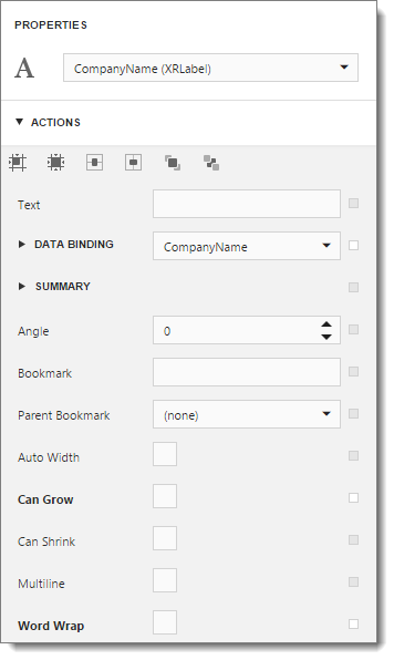
Selecting an object in the Layout Area makes that the selected object whose properties are displayed in the panel. You can also select an object from the drop-down list at the top of the Properties Panel. The properties displayed vary depending on the type of object selected; see the various help topics under the Objects heading for information about the properties.
Properties are ordered by category, such as Appearance and Behavior. To expand the list of properties under a category, click the arrow to the left of the category name. Click it again to collapse the list.
To change the value of a property, click its value. With some properties, you type a new value. For example, for Border Width, type the desired width. Some properties have a drop-down list of values. For example, when you click the value for Background Color, a color picker control appears. Some properties consist of sub-properties; such properties have a small right-pointing arrow beside their names. Click the arrow to expand the list to show the sub-properties. For example, Font consists of Name, Size, Bold, and several other sub-properties.
The heading for a value that hasn’t changed from its default setting appears in normal text while one that has been changed appears in bold. You can reset the value back to its default setting by clicking the small square to the right of the value and choosing Reset from the shortcut menu; this item is disabled for some properties, such as collections.
For each object type, the most commonly used properties appear in the Actions section in addition to the usual section they belong in. For example, for Label objects, Data Binding, Summary, and other frequently used properties appear there. In addition, the Actions section contains a toolbar of buttons for object alignment:
-
Align to Grid (
 ): moves the object so its top and left edges are on grid lines.
 -
Size to Grid (
 ): sizes the object so it fits between grid lines.
 -
Center Horizontally (
 ): centers the object horizontally.
 -
Center Vertically (
 ): centers the object vertically.
 -
Bring to Front (
 ): brings the object to the front of the object order so it’s on top of any objects it overlaps.
 -
Send to Back (
 ): sends the object to the back of the object order so it’s behind any objects it overlaps.
If multiple objects are selected, alignment and sizing options appear: aligning left, right, top, and bottom edges, aligning centers vertically and horizontally, sizing to the widest or tallest control, and adjusting horizontal and vertical spacing.
Field List
The Field List displays the fields and parameters in the result set for the report. To display the Field List, click the  button to the right of the Properties Panel. To display the Properties Panel again, click the
  button.
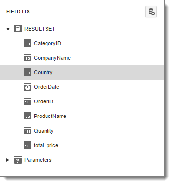
Under RESULTSET, you’ll see a list of the fields in the result set. The icon to the left of the field name shows the data type for the field, such as  for a string,
  for a datetime, and
  for the numeric field.
To add a calculated field, select RESULTSET and click the  button. A calculated field displays a different icon than a real field (
 ) but can be used as the data source for an object in the Layout Area just like a real field. To edit a calculated field, select it and click the
  button. Click the
  to delete it.
To add a parameter, select Parameters and click the  button. To edit a parameter, select it and click the button. Click the to delete it.