There are eighteen types of objects available. They share a common set of properties but each also has its own specific properties; click the link for each one to see the specific properties.
For each object type, the most commonly used properties appear in the Actions section in addition to the usual section they belong in. For example, for Label objects, Data Binding, Summary, and other frequently used properties appear there.
-
Label: this is the most common object: it displays text, such as the contents of a field in the report’s result set.
-
Check Box: this displays a Boolean (true or false or yes or no) field as a checked (for true) or unchecked (for false) check box.
-
Rich Text: some fields contain formatted text, such as red, bold, different fonts, and so on. These fields contain either Rich Text Format (RTF) or HyperText Markup Language (HTML), which uses codes to format the text. Displaying such a field using a Label displays the codes which is very difficult to read. Instead, use a Rich Text object, which displays the field’s content with full formatting.
-
Picture Box: some fields contain either images or the path to an image file on disk. Use a Picture Box object to display such field or if you want to add an image such as a logo to the report.
-
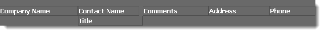
Panel: a panel is used to contain other objects. This is often used to give those objects a common background color, such as these column headings enclosed within a panel with a dark grey background:
There are no specific properties for Panels.
-
Table: a table displays data in a spreadsheet-like format. Tables aren’t used much in Horizon Reports except in cross-tab reports.
-
Line: draws a line on the report.
-
Shape: draws a shape on the report, such as a rectangle, ellipse, arrow, bracket, and so on.
-
Bar Code: displays the data for a field as one of several types of bar codes.
-
Zip Code: displays the data for a field graphically as a U.S. zip code.
-
Chart: charts the data as a pie chart, line graph, column chart, and so on. Adding a Chart to a report in the Advanced Report Designer doesn’t work well because the result set likely isn’t set up for it.
-
Sparkline): displays a very small line chart, showing the general shape of the variation in some value.
-
Pivot Grid: this object is similar to a PivotTable in Microsoft Excel, showing data with variables in the rows and columns. Horizon Reports doesn’t use this for cross-tab reports because they don’t paginate very well. Adding a Pivot Grid to a report in the Advanced Report Designer doesn’t work well because the result set likely isn’t set up for it. Instead, create a cross-tab report.
-
Subreport: this includes another report within the report. Subreports are how Horizon Reports displays linked reports as drilldowns or embedded reports. Adding a Subreport to a report in the Advanced Report Designer doesn’t work well because there isn’t another report object available. Instead, using the subreport feature to add a subreport to the report.
-
Page Info: this object is used to show the current date, page number, page count, or “Page X of Y” on a report.
-
Page Break: used to force a page break. Putting a Page Break in a group header band causes a page break when the group changes. Adding one to the detail band makes every record appear on its own page. There are no specific properties for Page Break objects.
-
Cross-band Line: like a Line, but this object can span multiple bands.
-
Cross-band Box: like Cross-band Line, this object can span multiple bands.
Common Properties
These are properties that all or most objects types have in common.
A special note about certain types of properties:
-
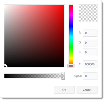
Color properties, such a Background Color and Border Color. Transparent means it shows the background color of its container (a band or a panel). Click the down arrow to display a color picker window you can use to choose the color.
-
Font properties have the following sub-properties:
-
Font Name: the font name to use. Choose the desired font from the drop-down list.
-
Size: the font size in the units specified in the Unit property.
-
Unit: the units for the Size property. The default is Point.
In addition, the Bold, Italic, Underline, and Strikeout buttons indicate the appropriate setting.
-
-
Dimension properties, such as Location, Padding, and Size, are measured in the units specified by the Measure Unit property of the report. The default is hundredths of an inch.
-
A format string property, usually called Format String, specifies how a value should be formatted. The format string is typically something like “{0:format},” where format is a set of symbols. Commonly used format symbols are:
Symbol Description cn Displays the value using the currency settings based on the Locale setting (for example, "$" as the currency symbol, "," as the thousands separator, and "." as the decimal separator in North America) and the number of decimal places specified as n. For example, 4132 formatted as c2 displays as $4,132.00 in North America and €4.132,00 in Germany. 0 A place holder for a digit, padded with a zero if necessary. For example, 4132 formatted as 000000 displays as 004132. # A place holder for a digit, blank if necessary. For example, 4132 formatted as #####0 displays as 4132. , Displays the thousands separator symbol based on the Locale setting (for example, "," in North America). You only have to specify the character once, not once every three places. For example, 4132 formatted as #,##0 displays as 4,132 in North America and 4.132 in Germany. . Displays a decimal separator symbol based on the Locale setting (for example, "." in North America). For example, 4132 formatted as #,##0.00 displays as 4,132.00 in North America and 4.132,00 in Germany. % Multiplies the value by 100 and appends a percentage sign. For example, 0.132 formatted as ##0.00% displays as 13.20%. d Displays a date/time value using the Short Date setting based on the Locale setting. For example, January 10, 2013 2:22:30 PM displays as 1/10/2013 in the U.S. and 10/01/2013 in France. D Displays a date/time value using the Long Date setting based on the Locale setting. For example, January 10, 2013 2:22:30 PM displays as Thursday, January 10, 2013 in the U.S. g Displays a date/time value using the Short Date setting based on the Locale setting, including the time without seconds. For example, January 10, 2013 2:22:30 PM displays as 1/10/2013 2:22 PM in the U.S. G Displays a date/time value using the Short Date setting based on the Locale setting, including the time with seconds. For example, January 10, 2013 2:22:30 PM displays as 1/10/2013 2:22:30 PM in the U.S. t Displays a date/time value using the Short Time setting based on the Locale setting. For example, January 10, 2013 2:22:30 PM displays as 2:22 PM in the U.S. T Displays a date/time value using the Long Time setting based on the Locale setting. For example, January 10, 2013 2:22:30 PM displays as 2:22:30 PM in the U.S. For numeric values, you can specify how positive, negative, and zero values are displayed by separating the three formats with semi-colons. For example, #,##0.00;-#,##0.00;”” formats positive numbers as #,##0.00, negative numbers as -#,##0.00, and zero as blank.
Other symbols can be used as well; see MSDN (such as http://msdn.microsoft.com/en-us/library/0c899ak8.aspx, http://msdn.microsoft.com/en-us/library/dwhawy9k.aspx, and http://msdn.microsoft.com/en-us/library/az4se3k1.aspx)
The common properties are described below.
Styles section
This section allows you to select which style an object uses or to create new styles. See the Styles topic for details. Some objects have Even Style and Odd Style styles, which affect how the object appears in alternating records.
Appearance section
-
Background Color: the background color of the object.
-
Border Color: the color of the object’s border. This is only applicable if at least one of the borders appears; see the Borders property.
-
Border Dash Style: the type of line used for the border: solid, dash, dot, dash-dot, dash-dot-dot, or double. This is only applicable if at least one of the borders appears; see the Borders property.
-
Border Width: the width of the border
-
Borders: which borders appear for the object. Click the down arrow to display a border picker where you can choose which borders should display.
-
Font: the font settings for the object.
-
Foreground Color: the foreground (text) color of the object.
-
Padding: the amount of space around the text as a margin. The sub-properties are All (setting this sets all the others to the same value), Bottom, Left, Right, and Top.
-
Text Alignment: the text alignment of the object.
-
Formatting Rules: clicking the “…” button displays the Formatting Rules Editor when you can select the formatting rules for the object.
Behavior section
-
Anchor Vertically: this property attaches the object to the specified side (top, bottom, or both). The CanGrow and CanShrink properties are ignored if this is set to Bottom or Both.
-
Anchor Horizontally: this property attaches the object to the specified side (left, right, or both).
-
Can Grow: turn this on if the object’s height can increase to display the entire contents of the object. If turned off, the property can’t grow so some of the content may be cut off.
-
Can Shrink: turn this on if the object’s height can decrease if the content doesn’t take up the current height.
-
Keep Together: if turned off, the text of the object can be split across pages when there isn’t enough room to print all of it on the current page. If turned on and text won’t all fit on the current page, the object is moved to the next page.
-
Visible: if turned on, the object is output when the report is run. If turned off, the object is not output.
-
Word Wrap: if turned on, the text is word wrapped to the next line if the object isn’t wide enough to display all the text on one line. Note that if Can Grow is turned on, the object grows vertically to accommodate the additional height required. If it’s turned off, the additional lines won’t appear so the text is cut off.
-
Scripts: displays the name of the script event handlers for each event raised by the object. To add an event handler for an event, choose it from the drop-down list.
Data section
-
Text: the text to display. This property is normally data-bound rather than being set manually.
-
Xlsx Format String: the format to use for the object’s values when the report is exported to Microsoft Excel.
-
Data Bindings: data binding allows some property of the object to get its value from a field or parameter. That’s how a label displays the value of a field in the result set, for example; its Text property is bound to the field. Different type of objects have different properties available for binding, but each data binding property has two sub-properties: Binding, which is the name of the field or parameter the property is bound to, and Format String, which specifies how to format the value. Commonly data-bound properties are Bookmark (the value of the field is used in the document map), Text (the object displays the value of the field), Check State (the Check Box object displays as checked or unchecked depending on value of the field), Html and Rtf (the Rich Text object displays the formatted HTML or RTF content of the field), Image (the Picture Box object displays the image stored in the field), and ImageURL (the Picture Box displays the image whose path on disk is stored in the field).
Design section
- Name: the name of the object. The name must start with a letter or underscore and can only contain letters, numbers, and underscores.
Layout section
-
Location: the object’s location. The sub-properties are X (the left edge of the object) and Y (the top of the object).
-
Size: the size of the object. The sub-properties and Height and Width.
Navigation section
-
Bookmark: the text for the bookmark in document map. If no object has Bookmark set or data-bound, there is no document map for the report. If there are bookmarks, a document map appears when the report is run; clicking a bookmark in the map jumps to the page where that bookmark appears. This property is normally data-bound rather than being set manually.
-
Parent Bookmark: if you want a hierarchical document map, set this property to the “parent” that this object’s bookmark should appear under.
-
Navigation Target: the target window or frame in which to display the linked content specified by the Navigation URL property.
-
Navigation URL: a URL to navigate to when the object is clicked.
Report Properties
The following are properties you can change if desired.
Appearance section
-
Padding: changing the padding sets the default value for that property for objects rather than controlling the report itself. See Common Properties for a discussion of padding.
-
Page Color: the background color for pages in the report. You won’t see the color in the Layout Area but you will when you run the report.
-
Watermark: specifies the settings of the watermark for the report. A watermark is text or an image that appears behind the other objects on the page. The sub-properties are:
-
Font: the font of the watermark text.
-
Foreground Color: the foreground color of the watermark text.
-
Text Transparency: the transparency of the text. The range is 0 to 255, with 0 being completely opaque and 255 completely transparent.
-
Text: the watermark text.
-
Text Direction: the direction of the watermark text.
-
Image: the path for the image to use as a watermark.
-
Image Transparency: the transparency of the image. The range is 0 to 255, with 0 being completely opaque and 255 completely transparent.
-
Image Tiling: set this to Yes to tile the image.
-
Image Alignment: the alignment for the image.
-
Image View Mode: specifies whether the image is clipped, stretched, or zoomed.
-
Page Range: the range of pages to display the watermark on.
-
Show Behind: set this to Yes to display the watermark behind the report contents or No to display it in front.
-
-
Formatting Rules: the formatting rules of the report.
Behavior section
-
Display Name: the descriptive name of the report.
-
Measure Units: by default, the measurement units of a report are hundredths of an inch. This setting affects the values for properties that specify size and location, such as Padding and Margins. The choices for this property are Hundredths of an Inch, Tenths of a Millimeter, or Pixels.
-
Request Parameters: turn this on to request the values of parameters from the user before running the report.
-
Show Margin Lines: turn this on to display page margin lines.
-
Vertical Content Splitting: this determines whether objects outside the right page margin are split across pages (Exact) or moved in their entirety to the next page (Smart).
-
Visible: this is normally turned on so it displays the objects in the report.
-
Script Language: the language to use for scripts.
-
Export Options: specifies options used when exporting the report. The CSV Export Options control output to comma-separated values (CSV) files. The sub-properties are:
-
Encoding: the type of data encoding to use.
-
Text Export Mode: if this is set to Value, only the content of the field is output. If it’s set to Text, the formatting is included.
-
Quote Strings with Separators: turn this on if a string containing the character defined in the Separator property should have quotes around it.
-
Separator: the character used to separate fields; a comma by default.
-
*Skip empty columns: turn this on to not output empty columns.
-
*Skip empty rows: turn this on to not output empty rows.
The HTML Export Options control output to HTML files. The sub-properties are:
-
Export Mode: specifies how the report is exported to HTML. Single File means a single file is created as one long report, Single File (Page-by-Page) means a single file is created but is paginated, and Different Files means one file is created per page.
-
Page Border Color: the border color of the page.
-
Page Border Width: the border width of the page.
-
Page Range: the range of pages to output.
-
Title: the title of the HTML document.
-
Table layout: turn this on to use table layout.
-
Remove Secondary Symbols: turn this on to remove secondary symbols, such as spaces and carriage returns, from the file to reduce its size.
-
Enable Images in HTML: turn this on to embed images in the HTML content.
The Image Export Options control output to image files. The sub-properties are:
-
Export Mode: specifies how the report is exported. Single File means a single file is created as one long report, Single File (Page-by-Page) means a single file is created but is paginated, and Different Files means one file is created per page.
-
Page Border’s Color: the border color of the page.
-
Page Border’s Width: the border width of the page.
-
Page Range: the range of pages to output.
-
Resolution: the resolution in DPI of the resulting image.
-
Format: the type of image to create: BMP, EMF, WMF, GIF, JPEG,.png, or TIFF.
The MHT Export Options control output to MHT (short for MIME HTML) files. MHT includes external resources, such as images, in the HTML document. The sub-properties are:
-
Export Mode: specifies how the report is exported to HTML. Single File means a single file is created as one long report, Single File (Page-by-Page) means a single file is created but is paginated, and Different Files means one file is created per page.
-
Page Border Color: the border color of the page.
-
Page Border Width: the border width of the page.
-
Page Range: the range of pages to output.
-
Title: the title of the HTML document.
-
Character Set: the character set to use in the file.
-
Table layout: turn this on to use table layout.
-
Remove Secondary Symbols: turn this on to remove secondary symbols, such as spaces and carriage returns, from the file to reduce its size.
The PDF Export Options control output to PDF files. The sub-properties are:
-
Convert Images to Jpeg: turn this on to convert images to JPEG when creating the file.
-
Show Print Dialog: turn this on to display the Print Dialog when the PDF file is opened.
-
Compressed: turn this on to compress the file.
-
Never Embed Fonts: a semi-colon delimited list of fonts which should not be embedded in the file. Embedded fonts make the file much larger but make them readable on systems that don’t have those fonts installed.
-
Image Quality: the quality of images in the file.
-
PDF A Compatibility: specifies compatibility with the PDF A format. The choices are None or PdfA2b.
-
Page Range: the range of pages to output.
-
Author: the name of the author.
-
Application: the name of the application creating the document.
-
Title: the title of the file.
-
Subject: the subject for the file.
-
Keywords: keywords for the file.
-
OpenPassword: the password to use to open the document.
-
Permissions Password: the password to change the restrictions.
-
Printing allowed: controls whether and what type of printing is allowed.
-
Changes allowed: controls whether and what type of changes are allowed.
-
Enable copying of text, images, and other content: turn this on to allow copying content.
-
Enable text access for screen reader devices for the visually impaired: turn this on to allow the document to be read by a screen reader device.
The RTF Export Options control output to RTF files. The sub-properties are:
-
Export Mode: specifies how the report is exported to HTML. Single File means a single file is created as one long report and Single File (Page-by-Page) means a single file is created but is paginated.
-
Page Range: the range of pages to output.
-
Export Watermark: turn this on to export the report’s watermark; see the Watermark property for details.
The Text Export Options control output to a text file. The sub-properties are:
-
Encoding: the type of data encoding to use.
-
Quote Strings with Separators: turn this on if a string containing the character defined in the Separator property should have quotes around it.
-
Separator: the character used to separate fields; a tab by default.
-
Text Export Mode: if this is set to Value, only the content of the field is output. If it’s set to Text, the formatting is included.
The XLS Export Options control output to Microsoft Excel 97-2003 XLS files. The sub-properties are:
-
Export Mode: specifies how the report is exported. Single File means a single file is created as one long report and Different Pages means a separate file is created for each page.
-
Export Hyperlinks: turn this on to include hyperlinks in the file.
-
Page Range: the range of pages to output.
-
Raw Data Mode: turn this on to only export data or No to include the formatting.
-
Sheet Name: the name to use for the worksheet.
-
Show Grid Lines: turn this on to display Excel’s grid lines.
-
Suppress 256 Columns Warning: turn this on to suppress the warning that appears if the spreadsheet has more than 256 columns.
-
Suppress 65536 Rows Warning: turn this on to suppress the warning that appears if the spreadsheet has more than 65,536 rows.
-
Text Export Mode: if this is set to Value, only the content of the field is output. If it’s set to Text, the formatting is included.
-
WorkbookColorPaletteCompliance: specifies the color palette compatibility mode with different workbook versions. The choices are ReducePaletteForExactColor, which keeps the original color values but only includes the first 56 colors in the palette, and AdjustColorsToDefault, which reduces the color values to match the 56 standard colors of the default workbook palette.
The XLSX Export Options control output to Microsoft Excel 2007 or later XLSX files. The sub-properties are:
-
Export Mode: specifies how the report is exported to HTML. Single File means a single file is created as one long report, Single File (Page-by-Page) means a single file is created but is paginated, and Different Files means one file is created per page.
-
Export Hyperlinks: turn this on to include hyperlinks in the file.
-
Page Range: the range of pages to output.
-
Raw Data Mode: turn this on to only export data or No to include the formatting.
-
Sheet Name: the name to use for the worksheet.
-
Show Grid Lines: turn this on to display Excel’s grid lines.
-
Text Export Mode: if this is set to Value, only the content of the field is output. If it’s set to Text, the formatting is included.
-
-
Report Print Options: the sub-properties are:
-
Print when Data Source is Empty: turn this on to allow the report to print when there are no records in the result set for the report or false to prevent the printing.
-
Detail Count at Design Time: enter a value to limit the number of records shown when the report is previewed in the Advanced Report Designer. This is useful if there are a lot of records, resulting in a lot of pages, and you want to tweak the report, preview it, tweak, preview, and so on without taking the time to render every page when previewing. 0 means there is no limit.
-
Detail Count when Data Source is Empty: enter a value to specify how many times to print the detail band when there are no records in the result set for the report.
-
Blank Detail Count: use this to specify the number of rows to move down as an indent before printing the detail band’s data for the first time when creating multi-column reports.
-
Detail Count: enter a value to limit the number of records printed. 0 means there is no limit.
-
-
Scripts: specifies the script names to execute at various times.
Data section
-
Data Source: automatically set by Horizon Reports and shouldn’t be touched.
-
Data Member: automatically set by Horizon Reports and shouldn’t be touched.
-
Filter String: this specifies an expression that filters the data in the report. You shouldn’t need to use this; instead, create a filter for the report in step 4 of the report wizards.
Design section
-
Name: the name of the band.
-
Snap Grid Size: by default, there are grid lines every 1/8 of an inch. To change the grid scale, edit the value of this property. By default, the measurement units of a report are hundredths of an inch, so a value of 12.5 means grid lines appear every 12.5/100 or 1/8 of an inch.
Navigation section
- Bookmark: the text shown as a root bookmark in the report’s document map.
Page Settings section
-
Roll paper: this indicates whether the report is supposed to be printed on roll paper; that is, as a single uninterrupted page.
-
Page Width: the width of the page in the units specified in Measure Units. This is disabled unless Paper Kind is set to Custom.
-
Page Height: the height of the page in the units specified in Measure Units. This is disabled unless Paper Kind is set to Custom.
-
Paper Kind: the type of paper for the report.
-
Margins: the bottom, left, right, and top page margins in the units specified in Measure Units.
Bar Code Properties
The following are properties specific to Bar Code objects.
Appearance section
- Alignment: this specifies how the object is aligned.
Behavior section
-
Auto-Module: if turned on, Module is calculated automatically based on the object’s size. If no, Module must be set manually.
-
Orientation: the orientation of the bar code: Normal, Upside Down, Rotate to the Left, or Rotate to the Right.
-
Module: the width of the narrowest bar or space in the bar code.
-
Show Text: if turned on, the text is shown along with the bar code.
-
Symbology: choose the type of bar code to display from the list of choices.
Check Box Properties
The following are properties specific to Check Box objects
Appearance section
- Glyph Alignment: determines whether the check box appears to the left (set to Near), middle (set to Center), or right (set to Far) of the text for the object.
Data section
-
Check State: specifies whether the object appears checked, unchecked, or indeterminate. This property is normally data-bound rather than being set manually.
-
Checked: similar to Check State, this specifies whether the object appears checked or not. Normally you should leave this property alone and let the data bound field control the value.
-
Text: the text for the checkbox. Other control usually data bind to this property but a checkbox normally has fixed text for Text and data binds to Check State instead.
Cross Band and Line Properties
The following are properties specific to Cross-band Line and Box objects.
Appearance section
- Line Style: the type of line: solid, dash, dot, dash-dot, dash-dot-dot, or custom. This only applies to Cross-band Line.
Layout section
-
End Band: the band to end the line or box in.
-
End Point: the location of the end of the shape. The sub-properties are X (the left edge of the object) and Y (the top of the object).
-
Start Band: the band to start the line or box in.
-
Start Point: the location of the start of the shape. The sub-properties are X (the left edge of the object) and Y (the top of the object).
Label Properties
The following are properties specific to Label objects.
Behavior section
-
Angle: specifies the angle to rotate the text to. Note that you may have to increase the height of the object to see all of the text.
-
Auto Width: turn this on to automatically size the width of the label to fit the contents. You won’t see the label width increase in the Layout Area but when the report is run, the label for each record is sized appropriately.
-
Multiline: turn this on if the content contains any carriage returns or line feeds so the text has line breaks.
-
Process Duplicates: what should happen if the value for the field in this record is the same as the one in the previous record. The choices are:
-
Leave: display the value.
-
Merge: identical values are merged into a single column.
-
Suppress: display a blank space instead of the value.
-
Suppress and Shrink: don’t display the value and shrink the height of the object.
-
-
Process Duplicates Target: specifies whether to process duplicate values of the Text or Tag property.
-
Process Null Values: what should happen if the value for the field in this record is null. The choices are:
-
Leave: display the value.
-
Suppress: display a blank space instead of the value.
-
Suppress and Shrink: don’t display the value and shrink the height of the object.
-
Data section
-
Null Value Text: the text to display if the field’s value is null, such as “Unknown” or “Empty.”
-
Summary: specifies how to summarize the value. The sub-properties are:
-
Ignore Null Values: set this to Yes to ignore null values when performing the summarization.
-
Format String: the format to use.
-
Running: where the summary value should be reset back to 0: None, Group, Report, or Page.
-
Function: the type of summarization to do: Average, Count, Sum, Running Summary, Percentage, Max, Min, Median, Variance, Population Variance, Standard Deviation, Standard Population Deviation, Average (Distinct), Count (Distinct), Summary (Distinct), Variance (Distinct), Population Variance (Distinct), Standard Deviation (Distinct), Standard Population Deviation (Distinct), Record Number, and Custom.
-
Line Properties
The following are properties specific to Line objects.
Appearance section
-
Line Direction: the direction of the line: Slant, Back Slant, Horizontal, or Vertical.
-
Line Style: the type of line: solid, dash, dot, dash-dot, dash-dot-dot, or custom.
-
Line Width: the width of the line.
Page Info Properties
Page Info objects show the current date, page number, page count, or “Page X of Y” on a report. The following are properties specific to Page Info objects.
Behavior section
-
Format: the format for the display. Format can contain text as well as the date or number. For example, “Page {0} of {1}” when Page Information is set to “Current of Total” Page Numbers displays something like “Page 3 of 5.” “Today’s Date: {0:d}” displays “Today’s Date: 04/03/2015” for a report run on that day.
-
Page Information: what the object should display. The choices are:
-
None: displays nothing.
-
Number: displays the page number.
-
NumberOfTotal: displays the page number and the page count.
-
RomLowNumber: displays the page number using lower-case Roman numerals.
-
RomHiNumber: displays the page number using upper-case Roman numerals.
-
DateTime: displays the current date and time
-
UserName: displays the Windows user name.
-
Total: displays the page count.
-
-
Running Band: the band the page information is based on. None means it’s not based on any band. The drop-down list also includes any group header bands. Setting Running Band to a group header band affects the page number and page count if the group resets the page number to 1. For example, the first group might show “Page 1 of 2” and “Page 2 of 2”, then the second group might show “Page 1 of 5,” “Page 2 of 5,” and so on.
-
Start Page Number: the number to start numbering pages from. The default is 1.
Picture Box Properties
There are two properties specific to Picture Box objects: Image and Image URL (both in the Data section). These are very similar in that you can choose an image to display but the difference is that the image specified in Image is saved in the report while that in Image URL is simply referenced by path. Setting one blanks the other.
If you want to display an image stored in a field in the database, use data binding instead: bind to Image if the field contains the image or ImageURL if the field contains the path to the image.
Rich Text Properties
The following are properties specific to Rich Text objects.
Behavior section
-
Process Duplicates: what should happen if the value for the field in this record is the same as the one in the previous record. The choices are:
-
Leave: display the value.
-
Merge: identical values are merged into a single column.
-
Suppress: display a blank space instead of the value.
-
Suppress and Shrink: don’t display the value and shrink the height of the object.
-
-
Process Duplicates Target: specifies whether to process duplicate values of the Text or Tag property.
-
Process Null Values: what should happen if the value for the field in this record is null. The choices are:
-
Leave: display the value.
-
Suppress: display a blank space instead of the value.
-
Suppress and Shrink: don’t display the value and shrink the height of the object.
-
Data section
- Null Value Text: the text to display if the field’s value is null, such as “Unknown” or “Empty.”
Shape Properties
The following are properties specific to Shape objects.
Appearance section
-
Fill Color: the color for the interior of the shape.
-
Line Width: the width of the shape’s line.
Behavior section
-
Shape: the type of shape to draw. The choices in the drop-down list include many types of shapes, including Rectangle, Ellipse, different types of arrows, and different types of stars.
-
Stretch: set this to Yes to stretch the shape to fill its space when it’s rotated.
Sparkline Properties
The following properties are specific to Sparklines.
Appearance section
-
View: the type of sparkline to draw. The choices are Line, Bar, WinLoss, and Area. The type of view determines which several sub-properties appear:
-
Area Opacity: the opacity of the area under the line. The range is 0 to 255, with 0 being completely transparent and 255 completely opaque. This only applies to Area sparklines.
-
Bar Distance: the distance between two bars in pixels. This only applies to Bar and WinLoss sparklines.
-
Color: the color of the sparkline.
-
End Point Color: the color of the end point of the sparkline.
-
End Point Marker Size: the size of an end point’s marker in pixels. This only applies to Area and Line sparklines.
-
Highlight End Point: true to highlight the end point of the sparkline.
-
Highlight Max Point: true to highlight the data point with the maximum value.
-
Highlight Min Point: true to highlight the data point with the minimum value.
-
Highlight Negative Points: true to highlight sparkline points with negative values.
-
Highlight Start Point: true to highlight the start point of the sparkline.
-
Line Width: the width of the sparkline in pixels. This only applies to Area and Line sparklines.
-
Marker Color: the color of line markers. This only applies to Area and Line sparklines.
-
Marker Size: the size of markers for data points in pixels. This only applies to Area and Line sparklines.
-
Max Point Color: the color of the data point with the maximum value.
-
Max Point Marker Size: the size of the marker for a data points with the maximum value, in pixels. This only applies to Area and Line sparklines.
-
Min Point Color: the color of the data point with the minimum value.
-
Min Point Marker Size: the size of the marker for a data points with the minimum value, in pixels. This only applies to Area and Line sparklines.
-
Negative Point Color: the color of data points with negative values.
-
Negative Point Marker Size: the size of the marker for a data points with negative values, in pixels. This only applies to Area and Line sparklines.
-
Show Markers: true to display markers for data points. This only applies to Area and Line sparklines.
-
Start Point Color: the color of the start point of the sparkline.
-
Start Point Marker Size: the size of a start point’s marker in pixels. This only applies to Area and Line sparklines.
-
Data section
-
Data Adapter: this property should be left blank.
-
Data Member: this property should be left blank.
-
Data Source: this property should be left blank.
-
Value Member: the name of the field that provides the values for the sparkline.
Zip Code Properties
There’s only one property specific to Zip Code objects: Segment Width (in the Behavior section), which is the width of the lines used to draw the numbers in the object.