Gauges
The Gauge dashboard item displays a series of gauges. Each gauge can communicate two values - one with a needle and the other with a marker on the scale.
Providing Data
The Web Dashboard allows you to bind various dashboard items to data in a virtually uniform manner. To learn more, see the Bind Dashboard Items to Data topic.
The only difference is in the data sections that the required dashboard item has. This topic describes how to bind a Gauge dashboard item to data.
Binding to Data in the Web Dashboard
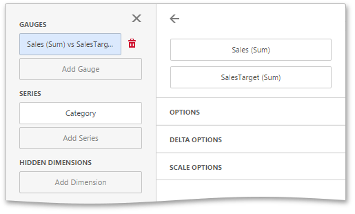
The image below shows a sample Gauge dashboard item that is bound to data.
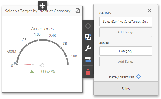
To bind the Gauge dashboard item to data, click a placeholder contained in one of the available data sections and select the required data source field in the Binding section of the invoked data item menu.
The table below lists and describes the Gauge’s data sections.
| Section | Processed as | Description |
|---|---|---|
| Gauges | Measure (both Actual and Target values) | Contains data items used to calculate values displayed by gauges. After you add the data item containing actual data, you can add the second data item (optional) that contains target data. If both items are provided, gauges show the difference between actual and target values, called delta. To learn more, see Delta. You can fill several data item containers in the Gauges section and use the Values drop-down menu to switch between the provided values. To invoke the Values menu, click the  icon in the dashboard item caption. icon in the dashboard item caption. |
| Series | Dimension | Contains data items whose values are used to label gauges.. |
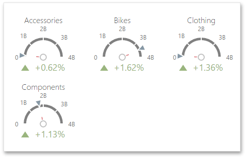
Delta
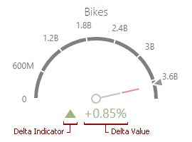
Gauges allow you to display the difference between the actual and target values of a particular parameter. This difference is called delta.
Delta is shown with a delta indicator (indicating whether the actual value is less than or greater than the target value) and delta values (representing this difference as an absolute value or a variation).
After you add the data item containing actual data, you can add the second data item (optional) that contains target data. To customize settings that relate to the calculation and display of deltas, open the Delta Options section of the data item menu.
Use it to define the conditions for displaying delta indication, specify which delta values should be displayed, and introduce the comparison tolerance.The following options are available.
| Option | Description |
|---|---|
| Value Type | Specifies which values should be displayed as the main delta value. Additional delta values are selected automatically. |
| Result Indication | Specifies the condition for displaying delta indication. |
| Threshold Type | Specifies the comparison tolerance in percentage values or in absolute values. |
| Threshold Value | Specifies the comparison tolerance value. |
Gauge Scale
By default, the Gauge dashboard item automatically determines the range of the gauge scales based on the values they display.
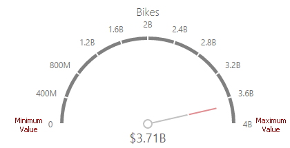
You can override this behavior and specify maximum and minimum values on the scale. After you add the data item, open the Scale Options section of the data item menu to customize the gauge scale.
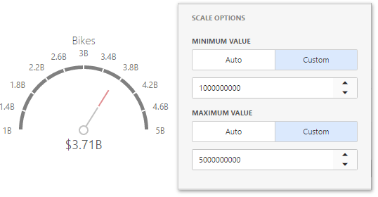
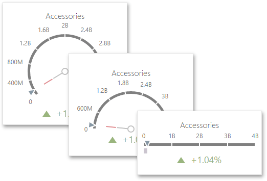
Then, set the minimum/maximum value mode to Custom and specify this value in the corresponding field. The image below shows a gauge with a minimum value of 1B and maximum 5B.
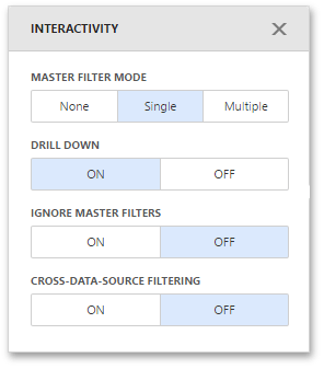
Interactivity
To enable interaction between the Gauge and other dashboard items, you can use the interactivity features, as Master Filtering and Drill-Down.
Master Filtering
You can use the Gauge dashboard item as a filter for other dashboard items. To learn more about filtering concepts common to all dashboard items, see the Master Filtering topic.
When Master Filtering is enabled, you can click a gauge(s) to make other dashboard items only display data related to the selected gauge(s).
To enable Master Filtering, go to the Gauge’s Interactivity menu and select the required Master Filtering mode.
To reset filtering, use the Clear Master Filter button (the  icon) in the Gauge’s caption.
Drill-Down
The built-in drill-down capability allows you to change the detail level of data displayed in dashboard items on the fly. To learn more about drill-down concepts common to all dashboard items, see the Drill-Down topic.
When drill-down is enabled, you can click a gauge to view the details.
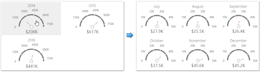
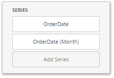
Drill-down requires that the Series section contains several dimensions at the top, from the least detailed to the most detailed dimension.
To enable Drill-Down, go to the Gauge’s Interactivity menu and turn the Drill-Down option on.
To return to the previous detail level, click the Drill Up button (the  icon) in the Gauge’s caption.
Layout
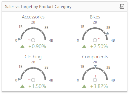
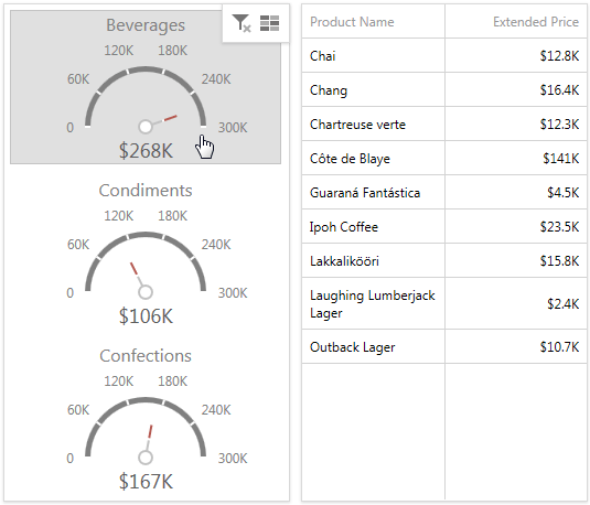
The Gauge dashboard item allows you to specify the number of columns or rows by which gauges are arranged. For example, the following image shows gauges arranged into 3 columns.
To control how gauges are arranged, use the Layout section in the Gauge’s Options menu.
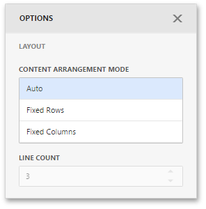
The following modes are available.
| Arrangement Mode | Description |
|---|---|
| Auto | Automatically resizes gauges to fit within the dashboard item. |
| Fixed Rows | Allows you to arrange gauges in a specific number of rows. |
| Fixed Columns | Allows you to specify the number of columns in which gauges are arranged. |
To specify the number of rows/columns, use the Line Count field.
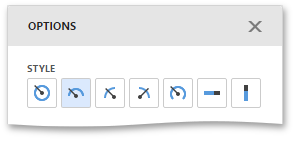
Style
The Gauge dashboard item allows you to select the gauge style.
The following types are available.
- Full Circular
- Half-Circular
- Left-Quarter Circular
- Right-Quarter Circular
- Three-Fourths Circular
- Linear Horizontal
- Linear Vertical
To select the gauge style, use the style icons in the Gauge Options menu.