Pivot
The Pivot dashboard item displays a cross-tabular report that presents multi-dimensional data in an easy-to-read format.
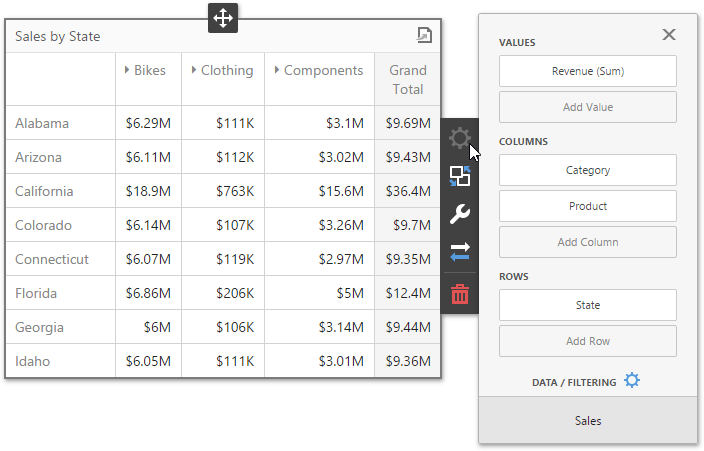
Providing Data
The Web Dashboard allows you to bind various dashboard items to data in a virtually uniform manner. To learn more, see the Bind Dashboard Items to Data topic.
The only difference is in the data sections that the required dashboard item has. This topic describes how to bind a Pivot dashboard item to data.
Binding to Data in the Web Dashboard
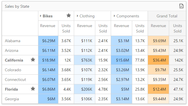
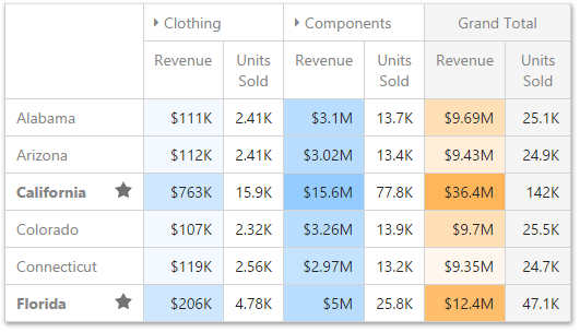
The image below shows a sample Pivot dashboard item that is bound to data.
To bind the Pivot dashboard item to data, click a placeholder contained in one of the available data sections and select the required data source field in the Binding section of the invoked data item menu.
The table below lists and describes the Pivot’s data sections.
| Section | Processed as | Description |
|---|---|---|
| Values | Measure | Contains data items used to calculate values displayed in the pivot table. |
| Columns | Dimension | Contains data items whose values are used to label columns. |
| Rows | Dimension | Contains data items whose values are used to label rows. |
Interactivity
To enable interaction between the Pivot and other dashboard items, you can use the interactivity features. These features include Master Filtering.
Master Filtering
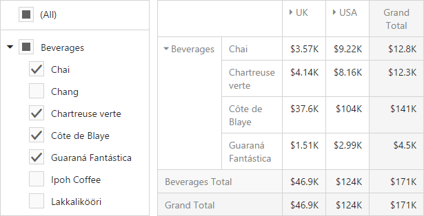
Data displayed in the Pivot dashboard item can be filtered by other master filter items. The image below displays the Pivot dashboard item filtered by Tree View.
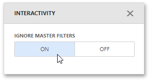
You can prevent the pivot from being affected by other master filter items using the Ignore Master Filters button in the Pivot’s Interactivity menu.
To learn more about filtering concepts common to all dashboard items, see the Master Filtering topic.
Conditional Formatting
A Pivot dashboard item highlights cells with a certain color, depending on the cell’s value. You can calculate a format rule by measures placed in the Values section and dimensions placed in the Columns or Rows section.
You can use hidden measures to specify a condition used to apply formatting to visible values.
Supported Format Rules
Format rules that can be applied to different data item types are as follows:
- numeric
- Value
- Top-Bottom
- Average
- Expression
- Icon Ranges
- Color Ranges
- Gradient Ranges
- Bar
- Bar Color Ranges
- Bar Gradient Ranges
- string
- Value (with the condition type set to Equal To, Not Equal To or Text that Contains)
- Expression
- date-time
- Value
- A Date Occurring (for dimensions with a continuous date-time group interval)
- Expression
- Icon and Color Ranges
- Color Ranges
- Gradient Ranges
- Bar
- Bar Color Ranges
- Bar Gradient Ranges
Refer to the following topic for more information about format condition types: Conditional Formatting in Web Dashboard.
Create and Edit a Format Rule
You can create and edit format rules in the Conditional Formatting section that is located in the following places:
-
The dashboard item’s Options menu
-
The data item menu
Refer to the following topic for information on how to create and edit format rules: Conditional Formatting in Web Dashboard.
Pivot-Specific Format Condition Settings
New appearance settings are applied to data cells that correspond to a row/column intersection. You can set a new intersection of the row and column or use predefined settings.
Note the following specifics:
- The dashboard does not calculate format rules in a pivot item for percentage values at multiple levels. In this case, the “All Levels” intersection mode is not available.
- If you create a new format rule for a dimension from the Columns/Rows section, the corresponding format condition dialog does not contain any Pivot-specific settings.
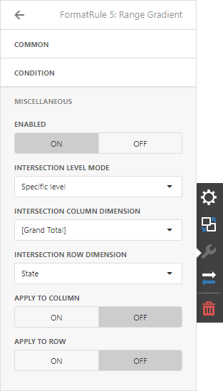
The format rule’s Miscellaneous section contains pivot-specific options:
| Option | Description |
|---|---|
| Enabled | Enables/disables the current format rule. |
| Intersection Mode | Specifies the level at which to apply conditional formatting to pivot cells. |
| Intersection Row/Column Dimension | Applies the format rule to the specified row/column dimension, if you select the Specific Level as the intersection mode. |
| Apply to Row/Column | Specifies whether to apply the formatting to the Pivot item’s entire row/column. |
A Pivot item allows you to specify the field intersection to which a format rule is applied.
| Intersection Level Mode | Description |
|---|---|
| Auto | Identifies the default level. For the Pivot dashboard item, Auto identifies the First Level. |
| First Level | The first level values are used to apply conditional formatting. |
| Last Level | The last level values are used to apply conditional formatting. |
| All Levels | All pivot data cells are used to apply conditional formatting. |
| Specific Level | The specified measures/dimensions are used to apply conditional formatting. |
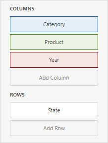
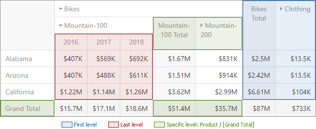
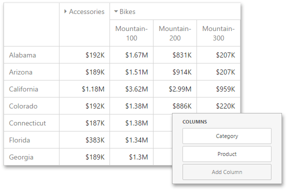
For example, the Pivot item has three fields in the column area (Year, Category, and Product) and one field in the row area (State):
The image below displays different intersection levels with the applied format rule:
To apply a format rule to the row or column Grand Total, change the Intersection Level Mode to Specific level and set the [Grand Total] value as the intersection row/column dimension.
Layout
This topic describes how to control the Pivot dashboard item layout, the visibility of totals and grand totals, etc.
Layout Type
If the Pivot dashboard item contains a hierarchy of dimensions in the Rows section, you can specify the layout used to arrange values corresponding to individual groups.
| Layout type | Example | Description |
|---|---|---|
| Compact | 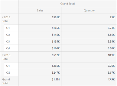 | Displays values from different Row dimensions in a single column. Note that in this case totals are displayed at the top of a group, and you cannot change totals position. |
| Tabular | 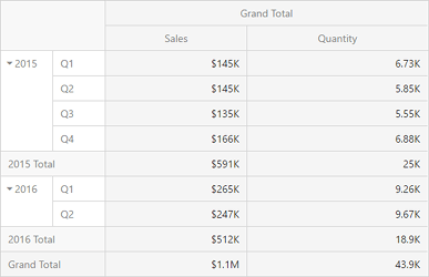 | Displays values from different Row dimensions in separate columns. |
| To change the Pivot layout, go to Options menu | Layout and use the Layout option. |
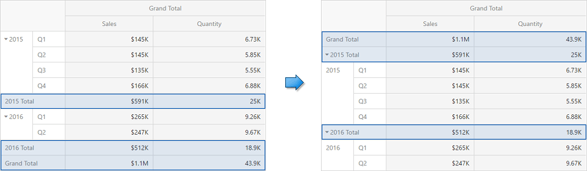
Totals Visibility
You can control the visibility of totals and grand totals for the entire Pivot dashboard item. For instance, the image below displays the Pivot dashboard item with the disabled row totals.
To manage the visibility of totals and grand totals, go to Options menu | Layout and use the following options:
- Row Totals / Row Grand Totals
- Column Totals / Column Grand Totals
| Moreover, you can control the visibility of totals for individual dimensions/measures. To do this, go to Bindings menu, select the required data item and use its Options | Show Totals option. |
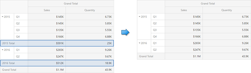
Totals Position
If necessary, you can change the position of totals/grand totals for the Pivot dashboard item. For instance, in the Image below the Pivot dashboard item whose row totals are moved from bottom to top.
To manage totals position, go to Options menu | Layout and use the following options:
- Row Totals Position
- Column Totals Position
Values Visibility
The Pivot dashboard item can contain several measures in the Values section. In this case, you can hide summary values corresponding to specific measures. For instance, the image below shows the Pivot with hidden Quantity values.
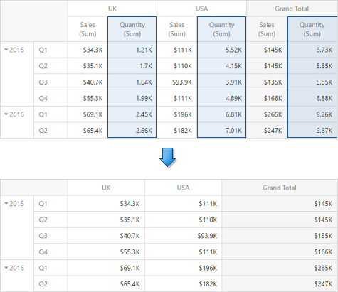
| To do this, go to Bindings menu, select the required measure and use its Options | Show Values option. |
Values Position
The Pivot dashboard item allows you to control the position of headers used to arrange summary values corresponding to different measures. For instance, you can display values in columns or in rows.
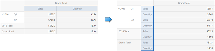
| To manage this position, go to Options menu | Layout and use the Values Position option. |
Expanded State
If the Columns or Rows section contains several data items, the Pivot column and row headers are arranged in a hierarchy and make up column and row groups.
You can collapse and expand row and column groups using the  and
and  buttons. However, the current expanded state of column and row groups do not save in the dashboard definition. If necessary, you can specify the default expanded state using the following options from Options menu | Initial State:
- Auto Expanded Column Groups - Specifies whether column groups should be collapsed or expanded by default;
- Auto Expanded Row Groups - Specifies whether row groups should be collapsed or expanded by default.