Cards
The Card dashboard item displays a series of cards. Each card illustrates the difference between two values. This difference can be expressed as an absolute value, an absolute variation or a percentage variation.
Providing Data
The Web Dashboard allows you to bind various dashboard items to data in a virtually uniform manner. To learn more, see the Bind Dashboard Items to Data topic.
The only difference is in the data sections that the required dashboard item has. This topic describes how to bind a Card dashboard item to data.
Binding to Data in the Web Dashboard
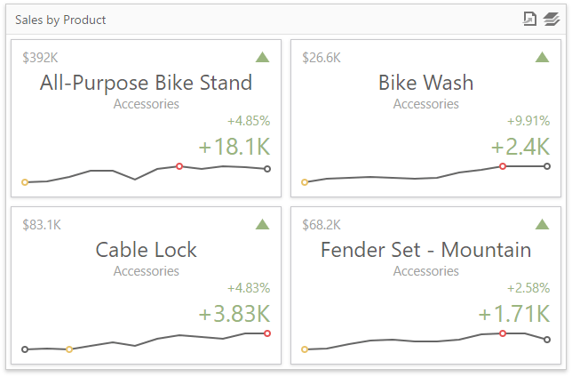
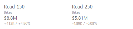
The image below shows a sample Card dashboard item that is bound to data.
To bind the Card dashboard item to data, click a placeholder contained in one of the available data sections and select the required data source field in the Binding section of the invoked data item menu.
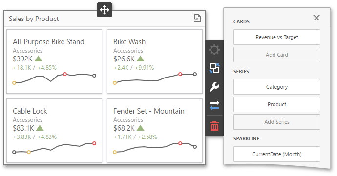
The table below lists and describes the Card’s data sections.
| Section | Processed as | Description |
|---|---|---|
| Cards | Measure (both Actual and Target values) | Contains data items used to calculate values displayed within cards. After you add the data item containing actual data, you can add the second data item (optional) that contains target data. If both items are provided, cards show the difference between actual and target values, called delta. To learn more, see Delta. You can fill several data item containers in the Cards section and use the Values drop-down menu to switch between the provided values. To invoke the Values menu, click the  icon in the dashboard item caption. icon in the dashboard item caption. |
| Series | Dimension | Contains data items whose values are used to label cards. |
| Sparkline | Dimension | Provides a date-time dimension whose data will be used to visualize values using sparklines. |
Layout
The Card dashboard item allows you to manage the position and visibility of elements displayed on cards. These elements include actual and target values, a delta indicator and corresponding delta values, a sparkline, etc.
To manage the position and visibility of card elements, choose a predefined layout template and customize its settings.
Available Layout Templates
The table below contains information about the available layout templates:
| Layout Type | Example | Description |
|---|---|---|
| Stretched | 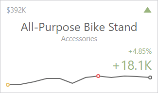 | The Stretched layout template arranges card elements so that they occupy an entire card area. |
| Centered | 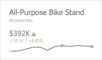 | The Centered layout template is used to center card elements so that they occupy a specified width/height. |
| Compact | 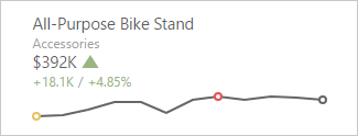 | The Compact layout template is used to arrange card elements so that they occupy the minimum area. |
| Lightweight |  | The Lightweight layout template displays the minimum set of elements within a card. |
For all layout types, you can change the visibility of its elements, or you can specify the display value type for data-bound elements. To learn more, see the Change Layout paragraph below.
Default Layout
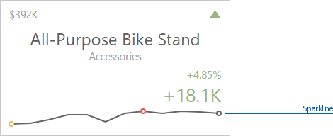
The Card dashboard item uses the Stretched layout template that arranges card visual elements in the following way by default:
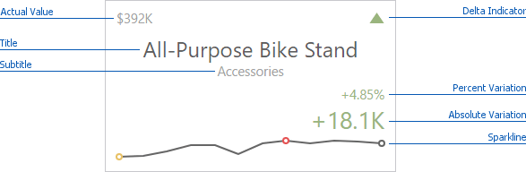
To learn more about the available value types and visual elements, see Change Layout.
Delta Indicator and delta values (such as Percent Variation or Absolute Variation) are colored depending on delta settings. To learn how to manage delta settings, see Delta.
Change Layout
To change a card’s layout in the Web Dashboard’s UI, invoke the Binding menu, click the required data item in the Cards section and go to Cards Layout in the data item’s menu. Select the required layout type and click the Edit button (the  icon) to change its settings. The following settings are available:
- Min width - Specifies the minimum width of the card content.
- Max width - Allows you to specify the maximum width of the card content. Select the Auto option to determine the maximum width automatically or switch to Custom and specify the required width manually.
You can show/hide the following values and visual elements within the card:
| Value | Description | Example |
|---|---|---|
| Title | Displays values of the last (bottommost) dimension placed in the Series section. | Microsoft Office Keyboard |
| Subtitle | Displays combined values of all dimensions except the last (bottommost) dimension. | Technology - Computer Peripherals |
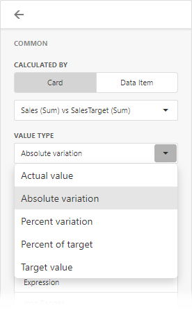
| Absolute Variation | An absolute difference between the actual and target value (see Delta). | +18.1K |
| Actual Value | A summary value for a measure placed in the Actual placeholder. | $392K |
| Card Name | A card name. | Revenue vs. Target |
| Percent of Target | A percent of a target value (see Delta). | 104.85 % |
| Percent Variation | A percent difference between the actual and target value (see Delta). | 4.85 % |
| Target Value | A summary value for a measure placed in the Target placeholder. | $374K |
| Dimension {Name} | Allows you to display values of a specific dimension placed in the Series section. | Technology |
| Element | Description | Example |
| Delta Indicator | Indicates whether the actual value is less or greater than the target value (see Delta). |  |
| Sparkline | Visualizes the variation of actual or target values. To learn more, see Sparkline. | 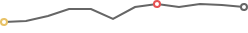 |
Use the Apply to All Cards button to propagate the specified layout settings to all cards corresponding to Actual-Target pairs. The Reset button resets all setting to their default values.
Delta
Cards allow you to visualize the difference between the actual and target values using special delta values and a delta indicator. If the default layout is used (Stretched layout type), the card displays the following delta values/elements:
- Delta Indicator - Indicates whether the actual value is less or greater than the target value.
- Percent Variation and Absolute Variation - delta values that show a difference between the actual and target value. You can also display the Percent of Target value. To do this, customize the card’s layout.
To customize settings that relate to the calculation and display of delta values/elements, invoke the Binding menu, click the required data item in the Cards section and go to Delta Options in the data item’s menu.
Then, specify the following settings:
- Result Indication - You can specify the condition for displaying delta indication.
-
Greater is Good - The ‘good’ indication is displayed if the actual value exceeds the target value; if the target value exceeds the actual value, the ‘bad’ indication displays.
-
Less is Good - The ‘bad’ indication displays if the actual value exceeds the target value; if the target value exceeds the actual value, the ‘good’ indication displays.
-
Warning if Greater - A warning displays only if the actual value exceeds the target value.
-
Warning if Less - A warning displays only if the target value exceeds the actual value.
-
No Indication - Indication does not display.
-
- Threshold type / Threshold value - For instance, you can specify that a specific indication should display when the actual value exceeds the target value by 10% or by $2K. Use the Threshold type combo box to select whether you wish to specify the comparison tolerance in percentage values or absolute values. Then use the Threshold value box to specify the comparison tolerance.
Sparkline
Sparklines can be used to visualize the variation of actual or target values (for instance, over time).
To learn how to display the sparkline for different layout types, see Layout.
Data Binding Specifics
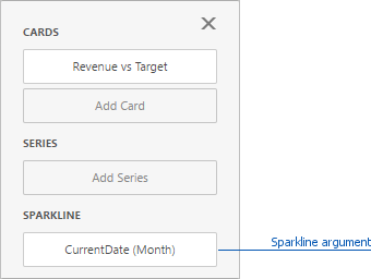
You need to provide a date-time or numeric dimension (in the Sparkline section) whose data is used as argument values to display a sparkline within the card.
If you have provided both actual and target values, a sparkline visualizes the actual value’s variation.
Change Sparkline Options
To change sparkline settings in the Web Dashboard’s UI, invoke the Binding menu, click the required data item in the Cards section and go to Sparkline Options in the data item’s menu. The following options are available:
| Sparkline Options | Description |
|---|---|
| View type | Defines the sparkline’s view type. Sparkline data points can be represented as area, line, bars, or win and loss squares. |
| Highlight min/max points | Specifies whether to highlight the minimum/maximum points of a sparkline. |
| Highlight start/end points | Specifies whether to highlight the start/end points of a sparkline. |
Formatting
The Card dashboard item formats the actual and target values displayed within cards using format settings specified for data items.
To change format settings in the Web Dashboard’s UI, invoke the Binding menu, click the required data item in the Cards section and go to Format Options in the data item’s menu. You can change format settings for the following value types:
- Actual Value
- Target Value
- Absolute Variation
- Percent of Target
- Percent Variation
To change format settings for the selected value type, click the Edit button (the icon). To learn more about format settings, see Formatting Numeric Values in the Formatting Data topic.
Interactivity
To enable interaction between the Card and other dashboard items, you can use interactivity features like Master Filtering and Drill-Down.
Master Filtering
The Dashboard allows you to use the Card dashboard item as a filter for other dashboard items. To learn more about filtering concepts common to all dashboard items, see the Master Filtering topic.
When Master Filtering is enabled, you can click a card(s) to make other dashboard items only display data related to the selected card(s).
To enable Master Filtering, go to the Card’s Interactivity menu and select the required Master Filtering mode.
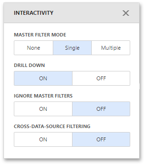
To reset filtering, use the Clear Master Filter button (the  icon) in the Card’s caption.
Drill-Down
The built-in drill-down capability allows you to change the detail level of data displayed in dashboard items on the fly. To learn more about drill-down concepts common to all dashboard items, see the Drill-Down topic.
When drill-down is enabled, you can click a card to view the details.
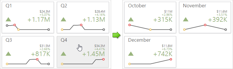
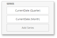
Drill-down requires that the Series section contains several dimensions at the top, from the least detailed to the most detailed dimension.
To enable Drill-Down, go to the Card’s Interactivity menu and turn the Drill-Down option on.
To return to the previous detail level, click the Drill Up button (the  icon) in the Card’s caption.
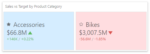
Cards Arrangement
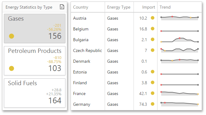
The Card dashboard item allows you to specify the number of columns or rows in which cards are arranged. For example, the following image show cards arranged into 3 columns.
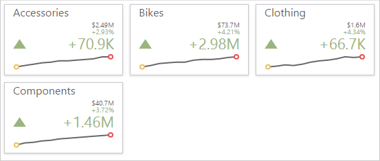
To control how cards are arranged, use the Layout section in the Card’s Options menu.
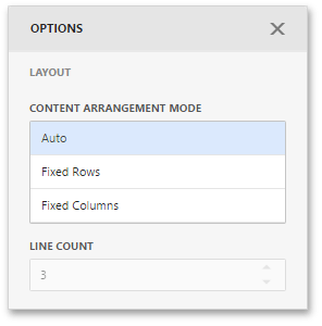
The following modes are available.
| Arrangement Mode | Description |
|---|---|
| Auto | Automatically resizes cards to fit within the dashboard item. |
| Fixed Rows | Allows you to arrange cards in a specific number of rows. |
| Fixed Columns | Allows you to specify the number of columns in which cards are arranged. |
To specify the number of rows / columns, use the Line Count field.
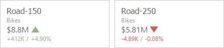
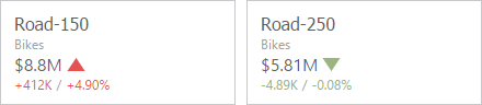
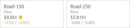
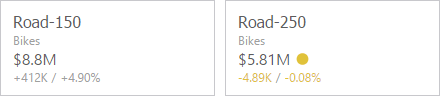
Conditional Formatting
For the Card dashboard item, you can apply conditional formatting to the card’s visual elements (like Title, Subtitle, various values) and change the card’s background.
Supported Format Rules
Format rules that can be applied to different data item types are as follows:
- numeric
- Value
- Top-Bottom
- Average
- Expression
- Icon Ranges
- Color Ranges
- Gradient Ranges
- string
- Value (with the condition type set to Equal To, Not Equal To or Text that Contains)
- Expression
- date-time
- Value
- A Date Occurring (for dimensions with a continuous date-time group interval)
- Expression
- Icon and Color Ranges
- Color Ranges
- Gradient Ranges
Refer to the following topic for more information about format condition types: Conditional Formatting in Web Dashboard.
Create and Edit a Format Rule
You can create and edit format rules in the Conditional Formatting section that is located in the following places:
-
The dashboard item’s Options menu
-
The data item menu
Refer to the following topic for information on how to create and edit format rules: Conditional Formatting in Web Dashboard.
Card-Specific Format Condition Settings
For a Card dashboard item, you can apply conditional formatting to the card’s visual elements (like Title, Subtitle, different values) and change the card’s background.
Available settings in the Common section depend on the selected Calculated by option:
-
The Card option specifies a data item container. The format rule is calculated based on the card’s values. The Value Type option specifies the card’s measurement upon which a condition is calculated.
If the Card dashboard item contains multiple values in data item containers (cards), make sure you apply a format rule to the active card to see changes. Click
 in the dashboard item caption to switch between cards. The expression format rule ignores the specified card and is applied to all cards regardless of the specified value.
 -
For the Data Item option, you can choose a hidden measure or series dimension. The rule applies to all cards in a Card item.
To apply the selected appearance to the Title, Subtitle, values, and other card layout elements, use the Apply to drop-down list. The All elements value applies the format rule to all card elements.
If you select a background color, it applies to the entire card and the Apply to value is not in effect.
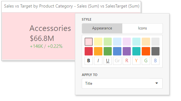
Some predefined background styles contain a font color. This font color applies to all the card elements regardless of the drop-down list settings (all/particular element).