Choropleth Map
The topics in this section describe the features available in the Choropleth Map dashboard item, that allows you to colorize the required areas in proportion to the provided values.
Providing Maps
This topic describes how to use the default Web Dashboard maps and configure their attributes.
Default Maps
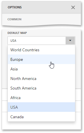
The Web Dashboard ships with a set of default maps showing various parts of the world. The following maps are included.
- World Countries - a map of the world
- Europe - a map of Europe
- Asia - a map of Asia
- North America - a map of North America
- South America - a map of South America
- Africa - a map of Africa
- USA - a map of the USA
- Canada - a map of Canada
The World Countries map has a lower level of detail than maps of specific regions and may not contain some of the countries. As an alternative, you can load a custom map with required granularity.
To select a required default map, go to the Common section of the Options menu and use the Default Map dropdown list.
Custom Maps
The Web Dashboard uses a Shapefile vector format to provide custom maps. Commonly, this format includes two file types:
- .shp file - holds map shapes (points/lines/polygons)
- .dbf file - contains attributes for each shape.
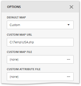
To provide a custom map, go to the Common section of the Options menu and change the Default Map value to Custom.
Finally, provide shape data using one of the following ways.
- Specify a path to the .shp file using the Custom Map URL option. Attributes from the corresponding .dbf file located in the same directory will automatically be included in the map.
- Load the existing shapefile using the ellipsis button next to the Custom Map File option. In the invoked dialog, locate the required .shp file. Use the Custom Attribute File option to locate the .dbf file containing attributes for each shape.
Note that custom maps created in the Cartesian coordinate system are not supported.
Map Attributes
After you select the default or custom map, you can display supplementary information (such as the name of a country, state, etc.). To do this, go to the Options menu and open the Attribute Name dropdown list.
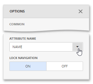
This list displays available attributes for the current map. Each set of attribute values is related to a specific map shape.
Providing Data
The Web Dashboard allows you to bind various dashboard items to data in a virtually uniform manner. To learn more, see the Bind Dashboard Items to Data topic.
The only difference is in the data sections that the required dashboard item has. This topic describes how to bind a Choropleth Map dashboard item to data.
Binding to Data in the Web Dashboard
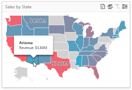
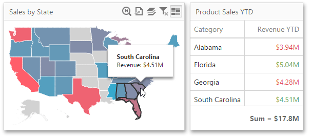
The image below shows a sample Choropleth Map dashboard item that is bound to data.
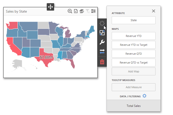
To bind the Choropleth Map dashboard item to data, click a placeholder contained in one of the available data sections and select the required data source field in the Binding section of the invoked data item menu.
The list below illustrates the Choropleth Map’s data sections.
- Attribute - Processed as Dimension - Allows you to associate map shapes with data source field values. To learn more about attributes, see the Map Attributes section.
-
Maps - Processed as Measure - Contains data items whose values are used to color map shapes. Map shape colors vary based on the map type.
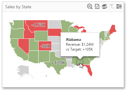
By default, map shapes are colored depending on the provided values. If you add an additional target value, the coloring of map shapes depends on the difference between two values called Delta.
-
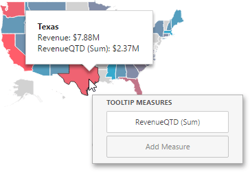
Tooltip Measures - Processed as Measure - Allows you to add supplementary content to the tooltips. Add the required measures to provide additional data.
Delta
The Choropleth Map allows you to indicate the difference between the actual and target values of a particular parameter. This difference is called delta.
By default, map shapes are colored depending on the values provided. If you add an additional target value to create delta, the coloring of map shapes depends on the difference between two values.
Add Delta
Delta is bound to two measures that provide two values: the Actual value and the Target value. The difference between these values is displayed on the map.
When you switch the map type to Delta, a new Target data item container appears.
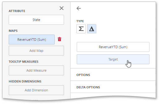
Click it to open the target data item menu and provide data for the target value.
Delta Options
To specify delta indication settings, go to the Delta Options section of the data item menu. Here you can specify the delta display mode (e.g., value or bar), value type, result indication, comparison tolerance, etc.
The following options are available.
| Option | Description |
|---|---|
| Value Type | Specifies which values to display within map tooltips as the delta value. |
| Result Indication | Specifies the condition that will be used to select the indicator color. |
| Threshold Type | Specifies the comparison tolerance in percentage values or in absolute values. You can specify that a required indicator should only be displayed when the difference between the actual and target values exceeds a specified value. |
| Threshold Value | Specifies the comparison tolerance value. |
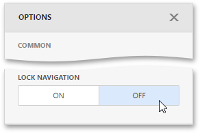
Map Navigation
The Choropleth Map dashboard item allows you to perform navigation actions such as zooming and scrolling using the mouse.
You can enable or disable the capability to scroll/zoom the map using the Lock Navigation setting in the Choropleth Map’s Options menu.
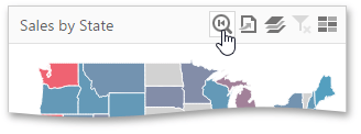
To display the entire map within the dashboard item, use the Initial Extent button (the  icon) in the Choropleth Map’s caption.
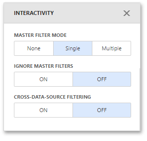
Interactivity
To enable interaction between the Choropleth Map and other dashboard items, you can use the interactivity features. These features include Master Filtering.
Master Filtering
You can use the Choropleth Map dashboard item as a filter for other dashboard items.
The Choropleth Map dashboard item supports filtering by shapes. When Master Filtering is enabled, you can click a shape (or multiple shapes) to make other dashboard items only display data related to the selected shape(s).
To learn more about filtering concepts common to all dashboard items, see the Master Filtering topic.
To enable Master Filtering, go to the Choropleth Map’s Interactivity menu and select the required Master Filtering mode.
To reset filtering, use the Clear Master Filter button (the  icon) in the Choropleth Map’s caption.
Labels
A Choropleth Map provides the capability to display titles within map shapes and allows you to manage what data to show in the shape tooltips.
To manage map titles and tooltips, go to the Shape Labels section of the Choropleth Map’s Options menu.
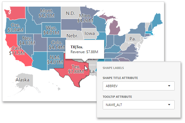
The following settings are available.
| Option | Description |
|---|---|
| Shape Title Attribute | Allows you to select the attribute whose values are displayed within corresponding map shapes. Summary values are included to shape titles by default. |
| Tooltip Attribute | Allows you to configure information related to a hovered shape. You can choose whether to use a binding attribute to display as the title of shape tooltips (the Use binding attribute value) or specify a custom attribute from the dropdown list. |
Legend
A legend is an element of a map that shows values corresponding to each color.
To display a legend within a map, open the Choropleth Map’s Options menu and go to the Color Legend section.
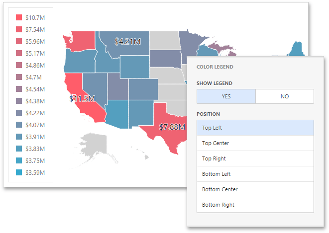
The following options are available.
| Option | Description |
|---|---|
| Show Legend | Allows you to control the visibility of legend. |
| Position | Specifies the legend’s position on a map. |