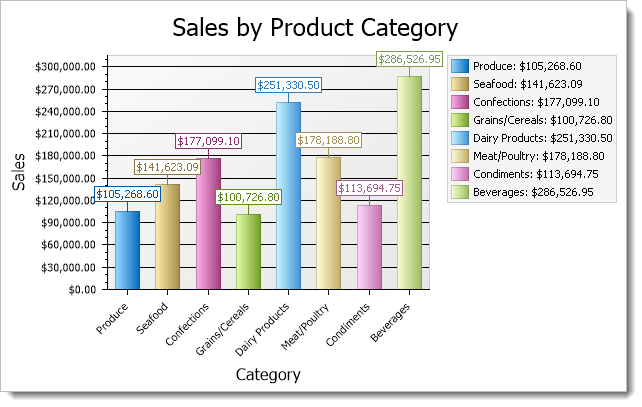
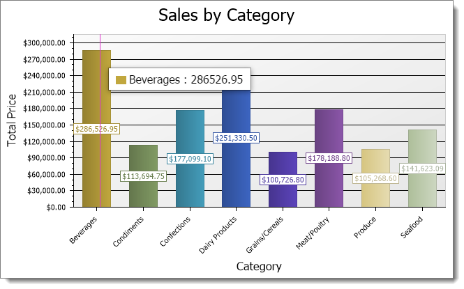
Horizon Reports can create charts and graphs from data in your database. For example, you may want to see a breakdown of your sales by product. You can graph this information as a pie chart, a bar chart, or one of the other chart types to suit your needs. Here’s an example of a chart:
To create a chart report, select at least two fields you want to appear in the chart, and then select where each field goes. There are three places a field can appear:
-
A category field appears in the category, or X, axis of most types of charts. For others, such as pie charts, a category field is used for something else, like the slices of a pie. For example, to show a chart of sales by product by year, use the product name as the category field.
-
A data field is the numeric value for each category item in the chart. For some types of charts, this is used to determine the size of a shape, such as the slice of a pie. For all other charts, it’s used for the values, or Y, axis. For example, to show a chart of sales by product by year, use the sale amount as the values field.
-
A series field is used to create multiple charts. For example, to show a chart of sales by product by year, use the sale date as the series field and display the year rather than individual dates using the Field Properties dialog. Not all charts have a series field.
How do you decide what type of chart to create? It depends on the type of data you have and how you want to present it. The Extreme Presentation Method blog has a diagram that illustrates the type of chart to choose based on what you want to show.
Here are some notes about how charts work:
-
You can specify how the values field is summarized. For numeric fields, the default is to sum the values. For all other types of fields, you can only have it count the number of values.
-
If you use a date field as the category or series field, you can specify how the date is displayed. For example, you may want to show the month or year rather than individual dates.
-
Series are optional. If you don’t specify a series field, the chart only has one series.
-
As your mouse pointer moves over a data point in a chart, such as a bar in a bar chart, a popup window shows the category and value for the data point. If the chart has a drillthrough subreport, the mouse pointer appears as a hand as it moves over a data point.
To create a chart report, choose Chart Report from the New menu.
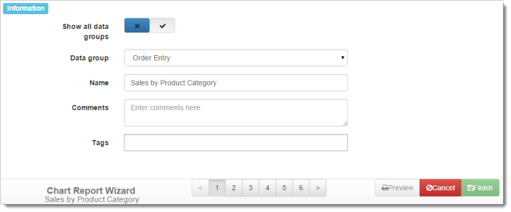
There are six steps in the Quick Report Wizard:
-
Step 1: Information: specify the report name, comments, and tags.
-
Step 2: Data Selection: choose the fields for the report and how they should be formatted.
-
Step 3: Chart Layout: specify which fields go in which section of the chart.
-
Step 4: Filtering: choose which records to include and exclude.
-
Step 5: Report Options: specify the type of chart and other options.
-
Step 6: Security: select which roles can access the report.
To move from one step to another in the wizard, click the next or previous buttons or choose a specific step number from the toolbar at the bottom.
The bottom right of the wizard has buttons to preview the report, cancel editing the report, or finish and save the report. You can preview your report any time after you have selected at least one field in the report. This is handy, since you can change something in the report, preview it to see how it looks, change it, preview again, and so on.