Step 5 allows you to specify how the chart appears. There are many options in this step but they are organized into groups.
As you make changes to the various options in this step, the sample chart displayed in this step automatically adjusts to show you what the chart looks like using your settings. However, it does not show actual data from your database; to do that, click the Preview button.
The Delete Advanced Layout button, which is only enabled if the report has an advanced layout, removes the advanced layout from the report.
The Drillthrough Properties button displays the Drillthough Properties dialog so you can define subreports for this report. This button is disabled if you haven’t selected any fields for the report.
The Advanced Report Properties button displays the Advanced Report Properties dialog so you can change some advanced settings. This button is disabled if you haven’t selected any fields for the report.
The settings on the General page are:
-
Width: the desired width of the chart.
-
Height: the desired height of the chart.
-
Localize: if this option is turned on, which it is by default, the report is “localized” when it’s run. Localizing a report meaning translating text into the language the user running the reports has chosen in the Options dialog. If you turn this option off, the report is run with these things in the language the report was created in.
-
Table layout: by default, Horizon Reports uses absolute positioning to render a report in the Preview window. While that normally works well, if you find that some objects aren’t positioned properly, you may wish to use HTML tables to render the report instead. In that case, turn this setting on.
-
Chart series: this specifies which series you want the Chart type setting to affect. If there’s more than one data field, the maximum value is the number of data fields; that is, if you have two data fields, the values for Chart series are 1 and 2. If there’s a series field, the maximum value is 10. This option only appears if there’s more than one data field or if there’s a series field.
-
Chart type: select the type of chart you want from the drop-down list. The choices are shown in the following table. The “Series” column shows “Single” for chart types that only appear when there’s no series field, “Multiple” for chart types that only appear when there is a series field, and “Both” for either case.
| Type | Description | Series | Sample |
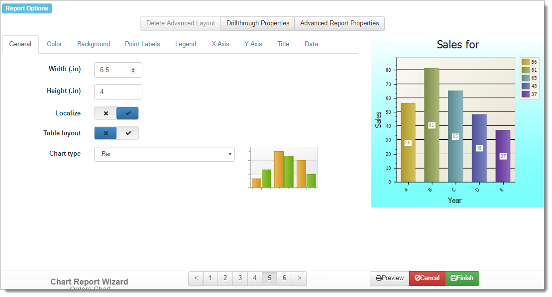
| Area | Displays series as filled areas on a diagram, with each data point displayed as a peak or hollow in the area. This is useful when you need to show trends for several series on the same diagram and also show the relationship of the parts to the whole. | Both | 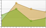 |
| Area 3D | A 3-D version of an area chart. | Both | 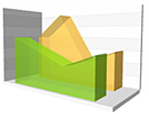 |
| Bar | Displays series as individual bars, grouped by category, and the height of each bar is determined by the series value. | Both |  |
| Bar 3D | A 3-D version of a bar chart. | Both | 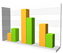 |
| Doughnut | Similar to a pie chart but with a hole in the middle | Single |  |
| Doughnut 3D | A 3-D version of a doughnut chart. | Single | 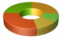 |
| Funnel | A chart that resembles a funnel. This is often used for values that decrease with time, stage, or other measure, such as a sales funnel. | Single |  |
| Funnel 3D | A 3-D version of a funnel chart. | Single | 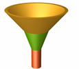 |
| Full Stacked Area | Similar to an area chart but the value of each data point is stacked with all the other corresponding data point values so the height of the area is always the full height of the chart. This is useful for comparing the percentage values of several series for the same category value. | Multiple | 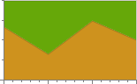 |
| Full Stacked Area 3D | The 3-D version of a Full Stacked Area chart. | Multiple |  |
| Full Stacked Bar | Similar to a bar chart but the value of each data point is stacked with all the other corresponding data point values so the height of the bar is always the full height of the chart. This is useful for comparing the percentage values of several series for the same category value. | Multiple |  |
| Full Stacked Bar 3D | The 3-D version of a Full Stacked Bar chart. | Multiple |  |
| Full Stacked Line | Similar to a line chart but the value of each data point is stacked with all the other corresponding data point values so the top line is always at the top of the chart. This is useful to compare how much each series adds to the total value for a given category value. | Multiple |  |
| Full Stacked Line 3D | The 3-D version of a Full Stacked Line chart. | Multiple |  |
| Full Stacked Spline Area | Similar to a Full Stack Area chart but with smooth, rounded lines. | Multiple |  |
| Full Stacked Spline Area 3D | The 3-D version of a Full Stacked Spline Area chart. | Multiple |  |
| Line | Displays values connected by lines. This is useful to show trends for several series on the same chart and to compare the values of several series for the same category values. | Both |  |
| Line 3D | A 3-D version of a line chart. | Both |  |
| Manhattan Bar | A bar chart in which the bars are arranged front-to-back instead of side-by-side. So called because it resembles the tall buildings in Manhattan. | Multiple | 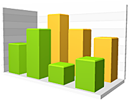 |
| Pie | Useful to compare the percentage values of different points in the same series and to show these values as easy to understand pie slices. | Single |  |
| Pie 3D | A 3-D version of a pie chart. | Single | 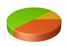 |
| Point | Displays each data value as a point. | Both | 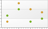 |
| Scatter Line | Displays data points in the same order as they are in the result set, as opposed to other chart types that sort their points in some way. | Both |  |
| Spline | Similar to a line chart but with a smooth, rounded line. | Both |  |
| Spline 3D | A 3-D version of a spline chart. | Both |  |
| Spline Area | Similar to an area chart but with smooth, rounded lines. | Both |  |
| Spline Area 3D | A 3-D version of a spline area chart. | Both | 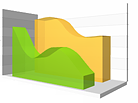 |
| Stacked Area | Similar to an area chart but the value of each data point is stacked with all the other corresponding data point values. This is useful to compare both the point values and their total for the same category value. | Both | 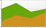 |
| Stacked Area 3D | A 3-D version of a stacked area chart. | Both | 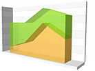 |
| Stacked Bar | Similar to a bar chart but the value of each data point is stacked with all the other corresponding data point values. This is useful to compare both the point values and their total for the same category value. | Both | 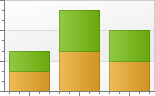 |
| Stacked Bar 3D | A 3-D version of a stacked bar chart. | Both | 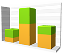 |
| Stacked Line | Similar to a line chart but the value of each data point is stacked with all the other corresponding data point values. This is useful to compare both the point values and their total for the same category value. | Both | 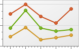 |
| Stacked Line 3D | A 3-D version of a stacked line chart. | Both | 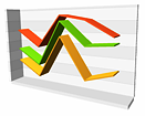 |
| Stacked Spline Area | Similar to a spline area chart but the value of each data point is stacked with all the other corresponding data point values. This is useful to compare both the point values and their total for the same category value. | Both | 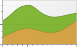 |
| Stacked Spline Area 3D | A 3-D version of a stacked spline area chart. | Both | 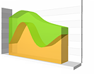 |
| Step Area | Similar to an area chart but with discrete steps instead of lines. | Both | 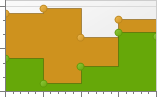 |
| Step Area 3D | A 3-D version of a step area chart. | Both | 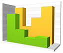 |
| Step Line | Similar to a line chart but with discrete steps instead of lines. | Both | 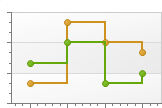 |
| Step Line 3D | A 3-D version of a step line chart. | Both | 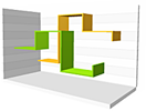 |
| SwiftPlot | Similar to a point chart but used when there are a large amount of data points so the scale is compressed. | Both | 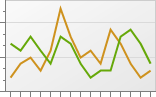 |
In addition to whether there is a series field or not, there are some other rules regarding which chart types are available. Generally, the chart type you select for the first series affects the choices available for the rest of the series because not all chart types are compatible with each other. Here are the rules:
-
If there’s more than one data field, only the 2-D versions of charts are available.
-
Because you can’t mix 2-D and 3-D charts, if you choose a 2-D chart type, such as Bar, for the first series, the list only shows 2-D types for the rest of the series. Similarly, if you choose a 3-D chart type for the first series, the list only shows 3-D types for the rest.
-
Because full stacked charts only work with themselves, if you choose one of them for the first series, the Chart series setting disappears and that chart type is used for all series.
How do you decide what type of chart to create? It depends on the type of data you have and how you want to present it. The Extreme Presentation Method blog has a diagram that illustrates the type of chart to choose based on what you want to show.
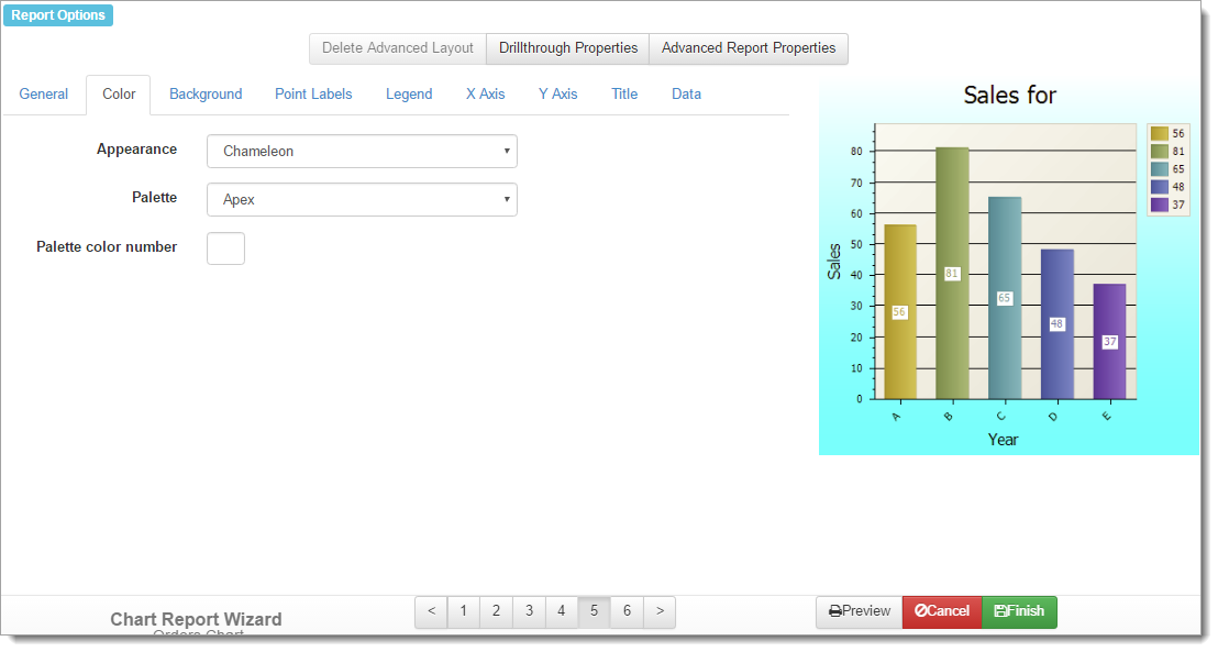
The Color page has the following options:
-
Appearance: selecting an appearance controls the colors of data items, chart background, and legend.
-
Palette: this option allows you to select one of several palettes of colors for your chart.
-
Palette color number: this allows you to set the base color used for all data points. Set this to 0 (the default) to use all colors of the selected palette or a specific value to use shades of one color for all data points.
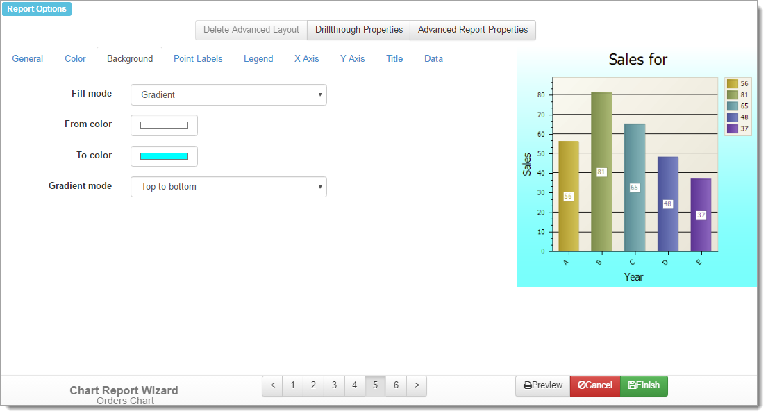
The Background page has the following options:
-
Fill mode: indicates how the background of the chart is drawn. “Empty” means use no color (that is, white), “Gradient” means use gradient colors, “Hatch” means use hatch marks, and “Solid” (the default) means use solid colors.
-
Background color: the background color to use. This option doesn’t appear if Fill mode is set to “Gradient.”
-
From color: this option, which is only available if you set Fill mode to “Gradient,” allows you to select the starting color for the gradient. The background is drawn in a gradient that transitions from From color to that of To color.
-
To color: this option, which is only available if you set Fill mode to “Gradient,” allows you to select the ending color for the gradient. The background is drawn in a gradient that transitions from From color to that of To color.
-
Gradient mode: specifies in which direction the gradient flows. The choices are bottom left to top right, bottom right to top left, bottom to top, from center horizontal, from center vertical, left to right, right to left, to center horizontal, to center vertical, top left to bottom right, top right to bottom left, and top to bottom. This only appears if you set Fill mode to “Gradient.”
-
Hatch color: the color to use for the hatches. This option only appears if Fill mode is set to “Hatch.”
-
Hatch style: this setting, which is only available if Fill mode is set to “Hatch,” indicates which hatch style to use for the background. There are many choices available.
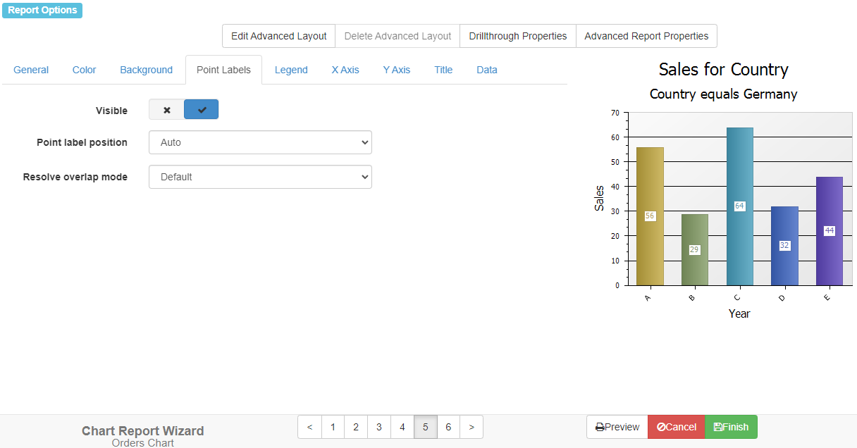
The Point Labels page allows you to control the appearance of the point labels, those labels inside the chart showing the values of each data point. The choices are:
-
Visible: turn this setting off if you don’t want point labels to appear or on if you do want them to appear.
-
Point label position: this controls where the point labels appear in the diagram.
-
Resolve overlap mode: this controls how to resolve labels that overlap when there are many data points or the values are long. The choices are:
-
None: does nothing.
-
Default: randomly changes the position of labels that are overlapped to avoid the overlap.
-
Hide overlapped: hides those point labels that are overlapped by another. Note: this mode doesn’t affect Pie, Doughnut, and Funnel charts.
-
Justify around point: changes the position of overlapped labels so they appear around the corresponding point’s center, but their indent from the point center is preserved. Note: this mode doesn’t affect Pie, Doughnut, Bar and Column charts.
-
Justify all around point: like Justify around point but affects all labels, whether overlapped or not. Note: this mode doesn’t affect Pie, Doughnut, Bar and Column charts.
-
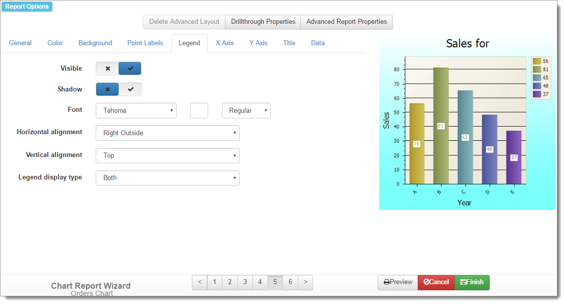
You can specify whether a legend appears on the chart using the settings on the Legend page. If a series field is used, the legend shows the different series values. If there’s more than one data field, the legend shows the fields. Otherwise, the legend shows the different category values. This page has the following options:
-
Visible: turn this option on to display a legend on the chart.
-
Shadow: turn this option on to display a shadow behind the legend.
-
Font: the font name, size, and style to use for the text in the legend.
-
Horizontal alignment: this option specifies where the legend appears horizontally on the chart. The choices are Left Outside and Right Outside.
-
Vertical alignment: this option specifies where the legend appears vertically on the chart. The choices are Top, Center, and Bottom.
-
Legend display type: this option specifies what to display in the legend: values only (Value), categories only (Category), or categories and values (Both).
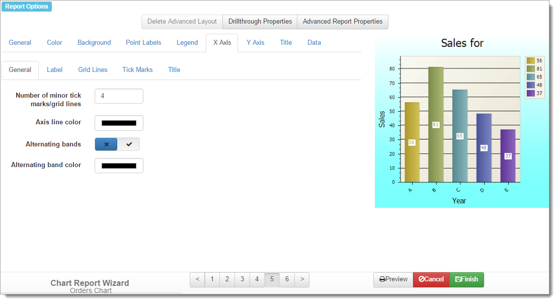
The X Axis and Y Axis pages have several subpages. The options on these subpages are identical.
The options on the General subpage are:
-
Number of minor tick marks/grid lines: this option affects both minor tick marks and minor grid lines for 2-D reports and only minor grid lines for 3-D reports. Set the desired number you wish to use.
-
Axis line color: the color to use for the axis line. This option isn’t available for 3-D reports.
-
Alternating bands: turn this option on to have alternating bands of color appear perpendicular to the axis.
-
Alternating band color: the color to use for the alternating bands.
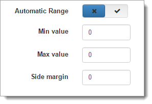
- Automatic Range: this option only appears when you edit the properties for the Y-Axis. Turn this off to change the values for Min value, Max value, and Side margin. These values represent the desired manual range for the Y-Axis, with the side margin value representing an optional range for the axis above the maximum Y-Axis value.
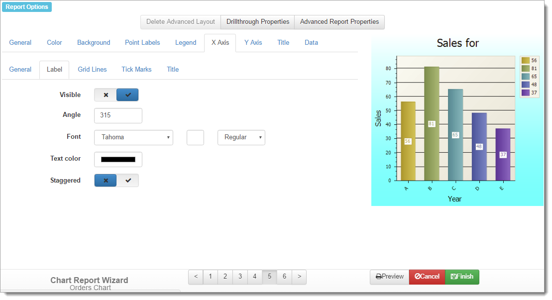
The Label subpage has the following options:
-
Visible: turn this setting on to display labels on the axis.
-
Angle: this setting controls the angle the labels appear at. The default for X-axis labels is 315 so they appear slanted and don’t overlap. The default for Y-axis labels is 0 since they can’t overlap.
-
Font: the font name, size, and style to use for the labels.
-
Text color: the color to use for the labels.
-
Staggered: if labels on the X-axis are fairly long, they can overlap each other. Turn this setting on to stagger the labels to minimize the overlap.
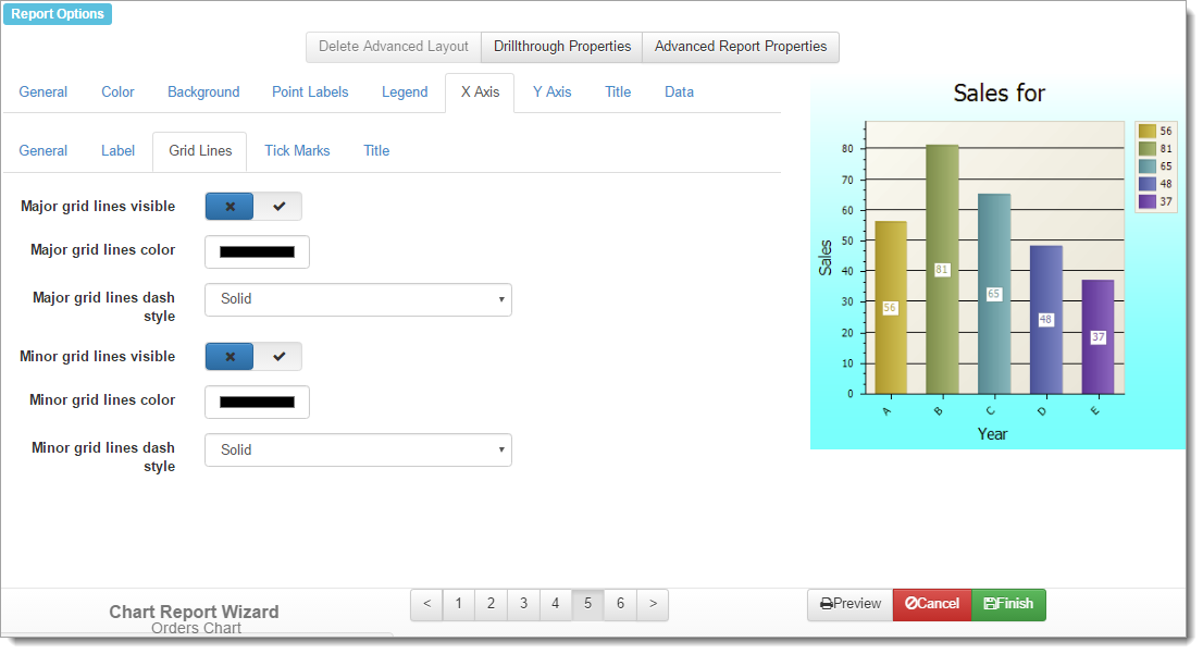
The Grid Lines subpage has the following options:
-
Major grid lines visible: turn this setting on to display major grid lines on the axis.
-
Major grid lines color: this setting specifies the color of the major grid lines.
-
Major grid lines dash style: this setting specifies the style of the major grid lines. The choices are Dash, Dash dot, Dash dot dot, Dot, or Solid (the default).
-
Minor grid lines visible: turn this setting on to display minor grid lines on the axis.
-
Minor grid lines color: this setting specifies the color of the minor grid lines.
-
Minor grid lines dash style: this setting specifies the style of the minor grid lines. The choices are Dash, Dash dot, Dash dot dot, Dot, or Solid (the default).
If you’re not sure whether you should use grid lines or not, Grid Lines in Graphs are Rarely Useful by Stephen Few has some interesting ideas.
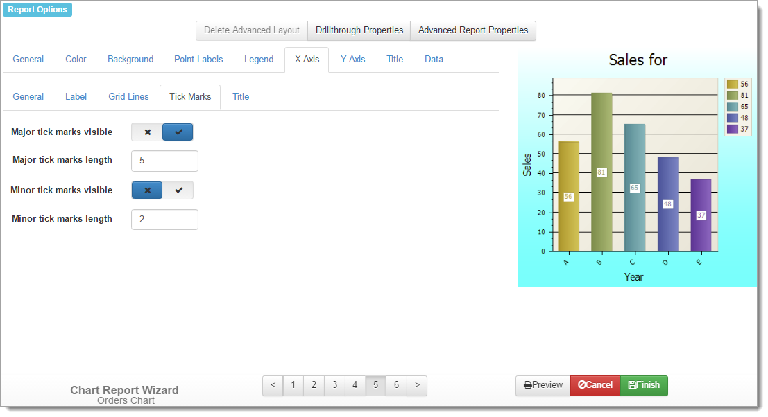
The Tick Marks subpage doesn’t appear for 3-D reports. It has the following options:
-
Major tick marks visible: turn this setting on to display major tick marks on the axis.
-
Major tick marks length: the length of the major tick marks.
-
Minor tick marks visible: turn this setting on to display minor tick marks on the axis.
-
Minor tick marks length: the length of the minor tick marks.
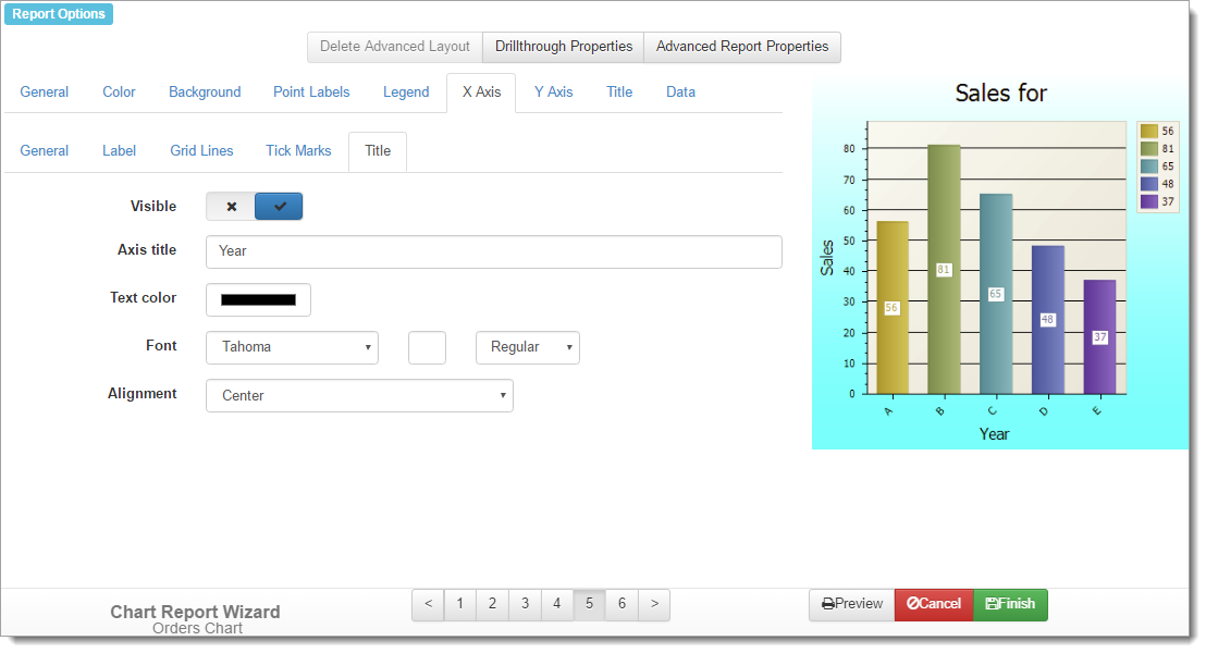
The Title subpage doesn’t appear for 3-D reports. It has the following options:
-
Visible: turn this setting on to display a title for the axis.
-
Axis title: the title for the axis.
-
Text color: the color to use for the title.
-
Font: the font name, size, and style to use for the title.
-
Alignment: the alignment for the title: Center (the default), Far (right aligned for left-to-right reading or left aligned for right-to-left reading), or Near (left aligned for left-to-right reading or right aligned for right-to-left reading).
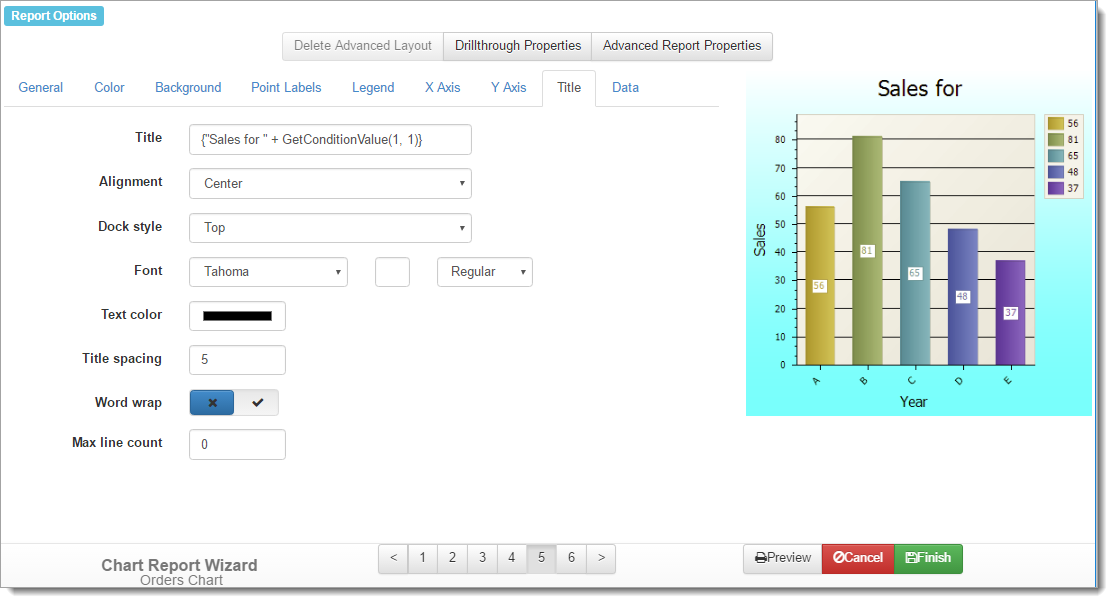
The settings on the Title page control the chart title. The options are:
-
Title: the title for the chart, which defaults to whatever you entered for Name. If you want to use an expression rather than fixed text, surround the expression with “{“ and “}” (without the quotes). Note that the expression must evaluate to a string value, so use the Str() function if necessary to convert non-string values such as dates and numbers to their string equivalent.
Here’s an example of an expression that displays “Sales for
" (such as "Sales for December 2015") in the report header: {"Sales for " + MonthName(Now()) + " " + Str(Year(Now()))}Suppose the report has an ask-at-runtime condition on Country and you want to display “Sales for country” in the title, where country is the country chosen by the user when they run the report. In that case, use the GetConditionValue function:
{"Sales for " + GetConditionValue(0, 0)}This expression displays the name of the report and the data source it reports on.
{Name + "\n" + DataSource}(The “\n” is a line break.)
-
Alignment: the alignment for the title: Center (the default), Far (right aligned for left-to-right reading or left aligned for right-to-left reading), or Near (left aligned for left-to-right reading or right aligned for right-to-left reading).
-
Dock style: where on the chart the title should appear: Bottom, Left, Right, or Top (the default).
-
Font: the font name, size, and style to use for the title.
-
Text color: the color to use for the title.
-
Title spacing: the amount of space between the title and the chart.
-
Word wrap: turn this setting on to allow a long title to word wrap onto more than one line. If this is turned off (the default), text beyond the area of the chart is cut off.
-
Max line count: if Word wrap is turned on and you have a very long title, this specifies how many lines the title may take. 0 means as many lines as necessary.
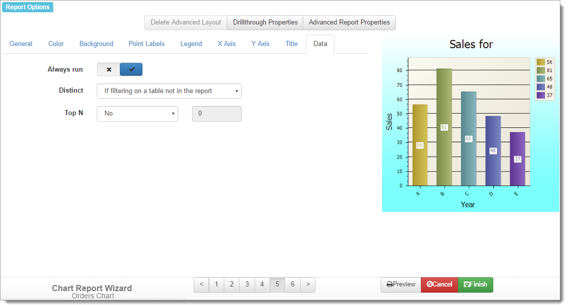
The Data page has the following options.
-
Always run: turn this option on to run the report even when there are no records that match your filter condition. This results in a blank report. If this option is turned off, rather than displaying a blank report, Horizon Reports displays a message that there are no records.
-
Distinct: if you filter on a field from a table that isn’t involved in the report, you may end up with what appear to be duplicate records. For example, say your report displays the Company Name and Contact Name from the Customers table. If you filter on the Product Name from the Products table being “Apricot Jam” (in other words, you want a list of customers who bought that product), you’d end up with each customer showing up once for every order they placed for that product. So, if Sam’s Grocery ordered it 25 times, they’d appear on the report 25 times. That isn’t typically something you’d want, so Horizon Reports can eliminate these duplicate records for you.
The DISTINCT clause in a SQL statement tells the database to only find records that have distinct values, so adding that clause to the SQL statement means that Sam’s Grocery only shows up once. The Retrieve distinct records option allows you to control whether the DISTINCT clause is used or not. “Never” means don’t add a DISTINCT clause to the SQL statement for this report and “Always” means do add it. “If filtering on a table not in the report” means only add the DISTINCT clause if you filter on a field from a table that isn’t involved in the report.
You might think that “If filtering on a table not in the report” should always be used. However, there may be times when this isn’t the correct behavior. For example, if you want to show fields from the Orders table (Order Date, Product Name, and Quantity Ordered) but filter on Company Name is “Sam’s Grocery,” Horizon Reports eliminates what it thinks are duplicate records, such as two orders for the same product and same quantity on the same day. Clearly, this isn’t right—you’d end up with some missing data. In that case, set this option to Never.
-
Top N: this option allows you to display only the top records. If you set this option to something other than “No,” you can enter a number and indicate whether that number is the number of records you want (the “Count” setting) or a percentage of the total records such as the top 10 percent (the “Percent” setting). Note that “top” refers to the sort order for the report. For example, if the report is sorted alphabetically by Company Name, you’ll get the specified number of records in alphabetical order. If the report is sorted in descending by Order Date, you get the specified number of most recent orders.