Chart
The topics in this section describe the features available in the Chart dashboard item, and provide information on how to create and customize charts in the Web Dashboard.
Providing Data
The Web Dashboard allows you to bind various dashboard items to data in a virtually uniform manner. To learn more, see the Bind Dashboard Items to Data topic.
The only difference is in the data sections that the required dashboard item has. This topic describes how to bind a Chart dashboard item to data.
Binding to Data in the Web Dashboard
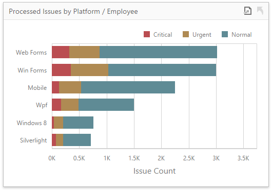
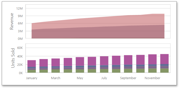
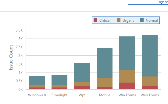
The image below shows a sample Chart dashboard item that is bound to data.
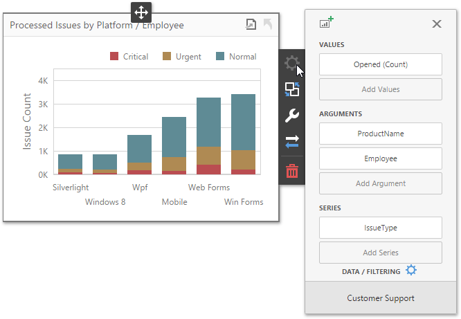
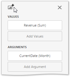
To bind the Chart dashboard item to data, click a placeholder contained in one of the available data sections and select the required data source field in the Binding section of the invoked data item menu.
The table below lists and describes the Chart’s data sections.
| Section | Processed as | Description |
|---|---|---|
| Values | Measure | Contains data items against which the Y-coordinates of data points are calculated. The data item menu allows you to select the series type and specify different options. Note that some types of series accept several measures. To learn more, see the documentation for the required series type. |
| Arguments | Dimension | Contains data items that provide values displayed along the X-axis of the chart. |
| Series | Dimension | Contains data items whose values are used to create chart series. |
Series
The Chart dashboard item supports different types of series - from simple bar and line charts to candle stick and bubble graphs.
Change Series Type
By default, Chart visualizes data using the Bar series. To switch between series types, click the required data item in the Values section and select the required series type in the invoked data item menu.
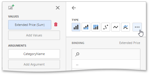
Click the ellipsis button to show all available series types.
Configure Series Options
To configure common series options, go to the data item’s Options section.
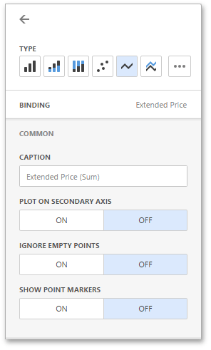
Here you can specify whether or not to plot the current series on the secondary axis, configure point markers behavior, etc.
The following options are available.
| Option | Description |
|---|---|
| Caption | Specifies the series caption. |
| Plot on secondary axis | Specifies whether or not the secondary axis is used to plot the current series. |
| Ignore empty points | Specifies whether or not empty points are ignored when plotting the current series. |
| Show point markers | Specifies whether or not to show point markers for the current series. This option is in effect for the Line and Area series. Note that point markers are always shown when Master Filtering is enabled for the Chart dashboard item. |
Configure Series Point Label
The Point Label section of a value data item allows you to enable series point labels and manage their settings.
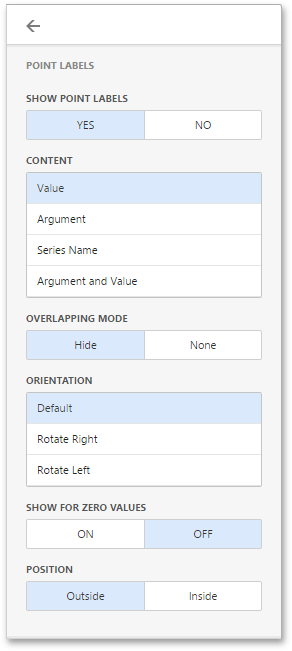
For example, you can specify whether or not to show point labels or set the label overlap mode.
The following options are available.
| Option | Description |
|---|---|
| Show Point Labels | Specifies whether or not to show point labels for the current series. |
| Content | Specifies the type of content displayed within point labels. You can select one of the following options: Value, Argument, Series Name or Argument and Value. |
| Overlapping Mode | Specifies the label overlap mode. You can reposition or hide overlapping labels or disable a resolving algorithm. |
| Orientation | Specifies the orientation of point labels. You can set default orientation or rotate point labels 90 degrees clockwise or counter clockwise. |
Bar series has additional settings.
| Option | Description |
|---|---|
| Show for zero values | Specifies whether or not to show labels for points with zero values. |
| Position | Specifies the position of point labels relative to bars. Point labels can be displayed inside or outside bars. |
Panes
Panes are visual areas within a diagram that display chart series. The Chart dashboard item can contain any number of panes.
Each pane has its own Y-axis and displays a specific set of series. All panes in a chart share the same X-axis.
Add Panes
To add a pane, click the Add Pane button in the Chart’s data item section.
Once a new pane is added, the Web Dashboard creates another Values section. Use this section to provide data items that supply values to be displayed in the new pane (see Providing Data for details on data binding).
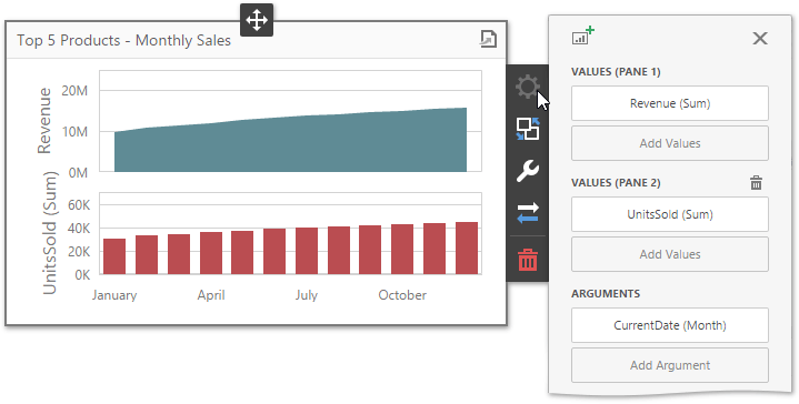
To remove a pane, click the Remove Pane button displayed in the added Values section.
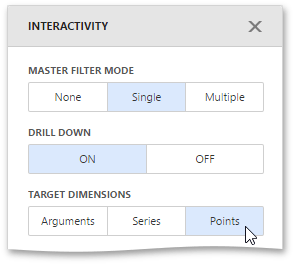
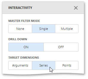
Interactivity
To enable interaction between the Chart and other dashboard items, you can use the interactivity features, as Master Filtering and Drill-Down.
Master Filtering
You can use the Chart dashboard item as a filter for other dashboard items. To learn more about filtering concepts common to all dashboard items, see the Master Filtering topic.
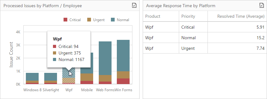
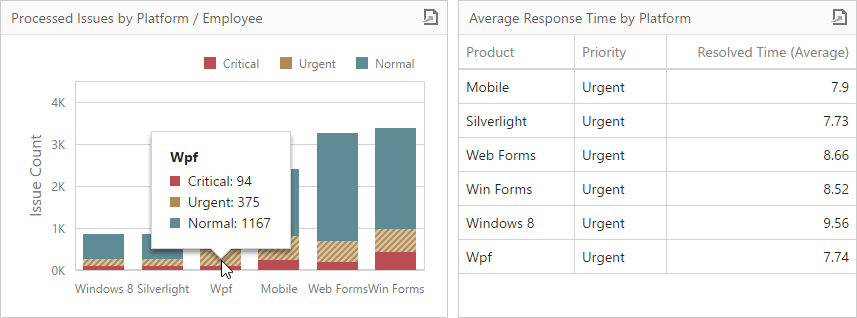
The Chart supports filtering by argument, series or points.
-
Filtering by arguments allows you to make other dashboard items display only data related to selected argument values by clicking series points.
-
When filtering by series is enabled, you can click a series point to make other dashboard items display only data related to the selected series.
-
Filtering by points makes other dashboard items display only data related to the selected point.
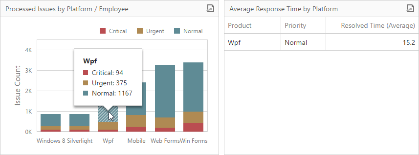
To configure filtering type, open the Chart’s Interactivity menu and select Arguments, Series or Points as a target dimension.
To reset filtering, use the Clear Master Filter button (the  icon) in the Chart’s caption.
Drill-Down
The drill-down capability allows you to change the detail level of data displayed in the Chart dashboard item. To learn more about drill-down concepts common to all dashboard items, see the Drill-Down topic.
The Chart supports drill-down on argument or series values.
-
To drill down on arguments, click a series point to view a detail chart for the corresponding argument value.
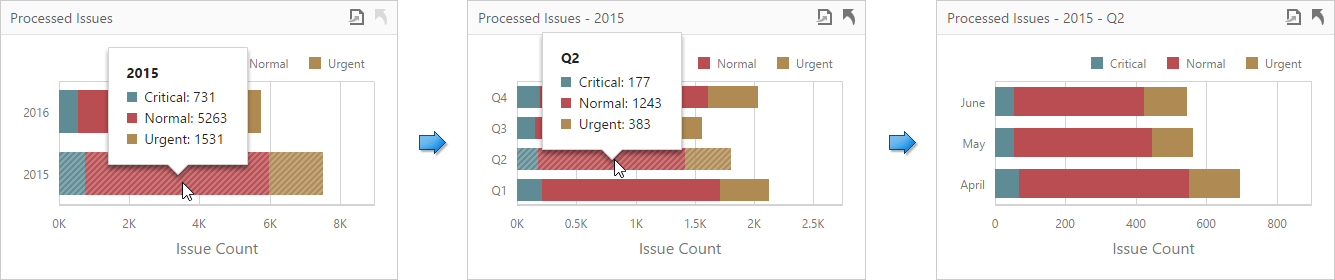
Drill-down on arguments requires that the Arguments section contains several data items, from the least detailed to the most detailed item.
-
When drill-down on series is enabled, you can click a series point to view a detail chart for the corresponding series.
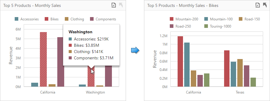
Drill-down on series requires that the Series section contains several data items, from the least detailed to the most detailed item.
To specify drill-down type, go to the Chart’s Interactivity menu and set Arguments or Series as a target dimension.
To return to the previous detail level, click the Drill Up button (the  icon) in the Chart’s caption.
Legend
A legend is an element of a chart that identifies chart series and series points.
To customize legend options, go to the Chart’s Options menu and open the Legend section.
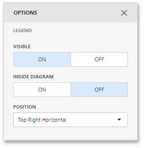
The following settings are available.
- The Visible option allows you to specify whether or not to show a legend.
- The Inside Diagram option allows you to locate a legend inside or outside the Chart.
- The Position option allows to set a legend’s position and orientation.
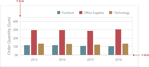
Axes
The Chart dashboard item displays two axes by default: the X-axis and the Y-axis. The X-axis is the axis of arguments and the Y-axis is the numerical axis of values.
Axis X
To access X-axis settings, go to the Chart’s Options menu and open the Axis X section.
You can configure the following settings.
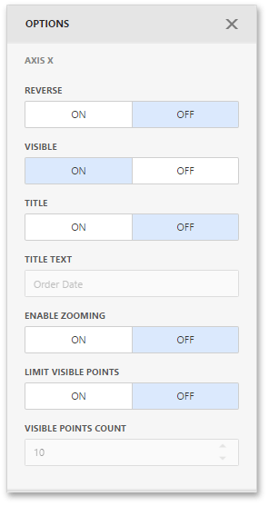
- The Reverse option allows you to reverse an X axis. If the X axis is reversed, its values are ordered from right to left.
- The Visible option specifies whether the axis is visible.
- The Title option specifies the X axis’s title. Use the Title Text field to set the title.
- The Enable Zooming option allows you to enable zooming for the X axis.
- The Limit Visible Points option allows you to limit the number of visible points. The Visible Points Count field allows you to specify the maximum number of visible points.
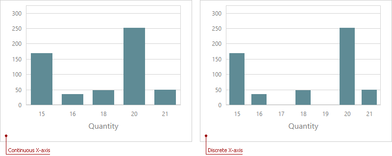
Continuous and Discrete X-Axes
If the dimension in the Arguments section contains numeric data, the Chart can create either a continuous X-axis or a discrete X-axis.
If a continuous axis is used, the distance between argument values is proportional to their values. On a discrete axis, all argument values are an equal distance from each other.
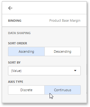
To specify the X-axis type in the Web Dashboard, go to the data item Data Shaping menu for the argument dimension and select the axis type. The image below illustrates how to change this setting for the Product Base Margin data item.
Axis Y
To access Y-axis settings, go to the Chart’s Options menu and open the Axis Y section for a corresponding pane.
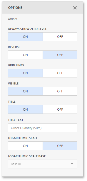
- The Always Show Zero Level option allows you to indicate whether or not an axis zero value should be displayed.
- The Reverse option allows you to reverse an Y-axis. If the Y-axis is reversed, its values are ordered from right to left.
- The Grid Lines options allows you to control the visibility of the reference lines used to improve the readability of a chart’s visual data.
- The Visible option specifies whether the axis is visible.
- The Title option specifies the Y-axis’s title. Use the Title Text field to set the title.
- The Logarithmic Scale option allows you to use a log scale to display Y-axis. Use the Logarithmic Scale Base field to set a log scale base.
Secondary Axis
The secondary Y-axis is useful when it is necessary to visually combine several charts into one. Secondary axes provide the ability to plot series with different ranges on the same chart.
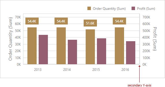
To plot the required series using the secondary axis, go to the data item Options menu for the value measure and turn the Plot on Secondary Axis option on.
Orientation
You can rotate the Chart so that the X-axis becomes vertical, and the Y-axis becomes horizontal.
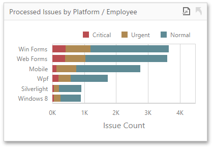
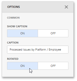
To rotate a Chart in the Web Dashboard, open the Chart’s Options menu and go to Common section. Then, turn the Rotated option on.
Conditional Formatting
Use conditional formatting to highlight chart elements such as bars, lines, areas, and data points.
The following series types support conditional formatting:
- Bar
- Point/Line
- Area
- Bubble
- Range Bar
Supported Format Rules
You can use the following data in rule calculations:
- measures from the Values section
- dimensions from the Arguments/Series section
- hidden measures
Format conditions that can be applied to different data item types are as follows:
- numeric
- Value
- Top-Bottom
- Average
- Expression
- Color Ranges
- Gradient Ranges
- string
- Value (with the condition type set to Equal To, Not Equal To or Text that Contains)
- Expression
- date-time
- Value
- A Date Occurring (for dimensions with a continuous date-time group interval)
- Expression
- Color Ranges
- Gradient Ranges
Refer to the following topic for more information about format condition types: Conditional Formatting in Web Dashboard.
Create and Edit a Format Rule
You can create and edit format rules in the Conditional Formatting section that is located in the following places:
-
The dashboard item’s Options menu
-
The data item menu
Refer to the following topic for information on how to create and edit format rules: Conditional Formatting in Web Dashboard.
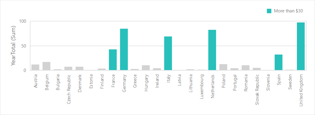
Chart-Specific Format Condition Settings
Specify appearance settings and set the condition’s value to create a format rule. Available settings depend on the selected format condition type.
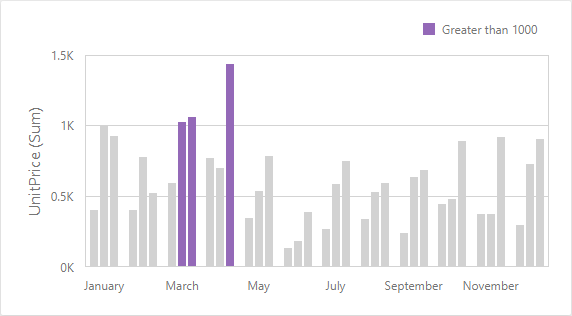
The image below displays the Value rule settings. The condition colors points/bars if their values exceed 1400.
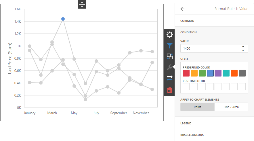
You can apply one of the predefined colors or set a custom color for this condition.
Use the Apply to chart elements button group to apply a rule to points or lines.
- Point: A rule applies to the data points such as bars, points and bubbles.
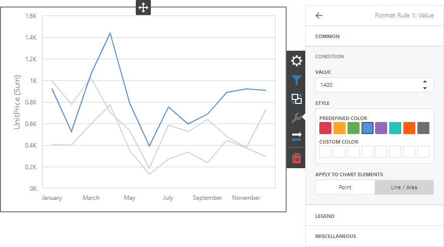
- Line / Area: A rule applies to lines and areas.
If you select Line / Area, the format rule applies to the line when at least one line point meets the rule’s condition:
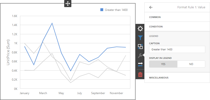
Go to the rule’s Legend section and set the Caption field to specify the legend’s text. It enables the Display in Legend option and the Chart item displays information about the applied rule in the legend.
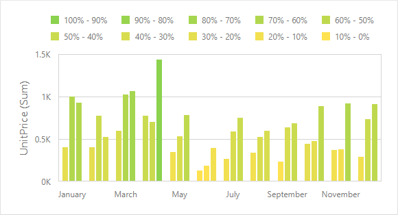
For Range format rules, the legend display text is generated automatically and depends on range intervals:
Coloring
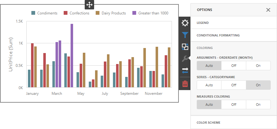
A Chart item paints elements in pale gray if they do not meet the applied format condition. Note that this does not apply to elements that are painted by different hues.
Enable coloring for series to restore the color scheme:
Documentation: Web Dashboard - Coloring