Grid
The topics in this section describe the features available in the Grid dashboard item, and provide information on how to create and customize grids
Providing Data
The Web Dashboard allows you to bind various dashboard items to data in a virtually uniform manner. To learn more, see the Bind Dashboard Items to Data topic.
The only difference is in the data sections that the required dashboard item has. This topic describes how to bind a Grid dashboard item to data.
Binding to Data in the Web Dashboard
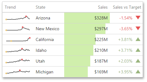
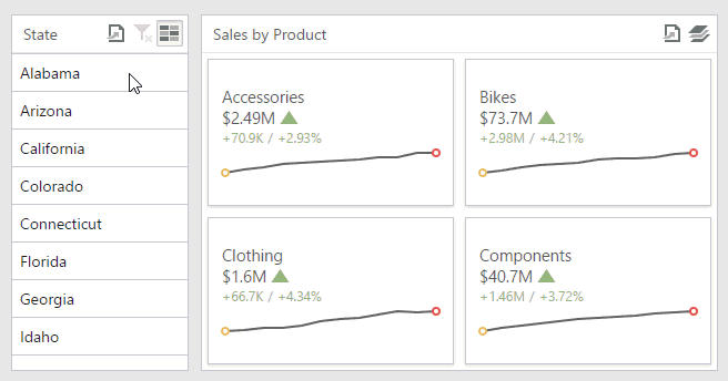
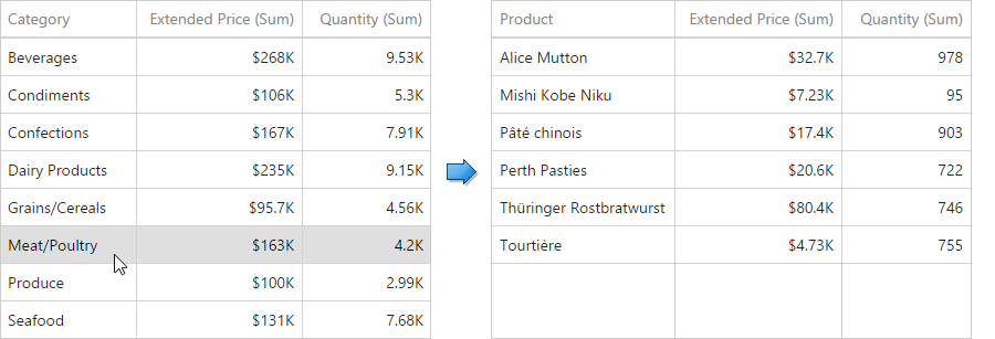
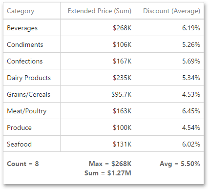
The image below shows a sample Grid dashboard item that is bound to data.
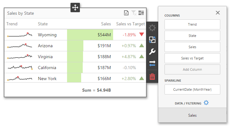
To bind the Grid dashboard item to data, click a placeholder contained in one of the available data sections and select the required data source field in the Binding section of the invoked data item menu.
The table below lists and describes the Grid’s data sections.
| Section | Processed as | Description |
|---|---|---|
| Columns | Dimension or Measure (depending on the selected column type) | Contains data items that provide values for grid columns. The data item menu allows you to select the column type and specify their options. |
| Sparkline | Dimension | Contains a data item that provides arguments for sparkline columns. To learn more, see Columns. |
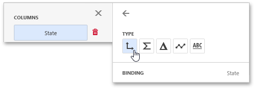
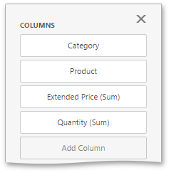
Columns
The Grid dashboard item supports four types of columns.

-
Dimension
A dimension column displays values from the bound data item “as is”. If the dimension column is bound to a data source containing images, it can display images.
-
Hyperlink
A dimension column allows you to display hyperlinks in the Grid dashboard item. You can provide hyperlinks as a separate data column, or they can be automatically created at run-time from any column using the specified URI pattern.
-
Measure
A measure column displays summaries calculated against data in the bound data item.
Values in the measure column can be displayed as text or represented by bars.
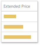
To select between these modes, open the column menu and go to the Options section.
-
Delta
A delta column calculates summaries against two measures: the Actual value and the Target value. When you switch the column type to Delta, a new Target data item container appears.

The difference between these values is displayed within the column.
You can configure delta options in the Delta Options section of the column menu.
-
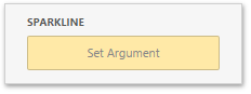
Sparkline
A sparkline column visualizes the variation of summary values over time.
The sparkline column is bound to the measure providing sparkline values and to the dimension providing a date-time interval. Add the required date-time dimension to the Sparkline placeholder to show values depending on time.
You can configure sparkline options in the data item’s Sparkline Options section.
When you drop a data item into the Columns section, the type for the new column is determined automatically based on the data type.
To change the column type, open the column menu and click the corresponding type button.
Interactivity
To enable interaction between the Grid and other dashboard items, you can use the interactivity features, as Master Filtering and Drill-Down.
Master Filtering
You can use the Grid dashboard item as a filter for other dashboard items. To learn more about filtering concepts common to all dashboard items, see the Master Filtering topic.
The Grid dashboard item supports filtering by rows.
When Master Filtering is enabled, you can click a grid row (or multiple rows) to make other dashboard items only display data related to the selected record(s).
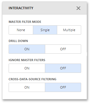
To enable Master Filtering, go to the Grid’s Interactivity menu and select the required Master Filtering mode.
To reset filtering, use the Clear Master Filter button (the  icon) in the Grid’s caption.
Drill-Down
The built-in drill-down capability allows you to change the detail level of data displayed in dashboard items on the fly. To learn more about drill-down concepts common to all dashboard items, see the Drill-Down topic.
The Grid dashboard item supports drill-down for rows.When drill-down is enabled, you can click a grid row to view the details.
Drill-down requires that the Columns section contains several dimensions at the top, from the least detailed to the most detailed dimension.
To enable Drill-Down, go to the Grid’s Interactivity menu and turn the Drill-Down option on.
To return to the previous detail level, click the Drill Up button (the  icon) in the Grid’s caption.
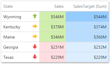
Conditional Formatting
Use conditional formatting to highlight individual cells or rows based on specific conditions. You can apply format rules to the dimension and measure column types. You can use hidden measures to specify a condition used to apply formatting to visible values.
Supported Format Rules
Format rules that can be applied to different data item types are as follows:
- numeric
- Value
- Top-Bottom
- Average
- Expression
- Icon Ranges
- Color Ranges
- Gradient Ranges
- Bar
- Bar Color Ranges
- Bar Gradient Ranges
- string
- Value (with the condition type set to Equal To, Not Equal To or Text that Contains)
- Expression
- date-time
- Value
- A Date Occurring (for dimensions with a continuous date-time group interval)
- Expression
- Icon and Color Ranges
- Color Ranges
- Gradient Ranges
- Bar
- Bar Color Ranges
- Bar Gradient Ranges
Refer to the following topic for more information about format condition types: Conditional Formatting in Web Dashboard.
Create and Edit a Format Rule
You can create and edit format rules in the Conditional Formatting section that is located in the following places:
-
The dashboard item’s Options menu
-
The data item menu
Refer to the following topic for information on how to create and edit format rules: Conditional Formatting in Web Dashboard.
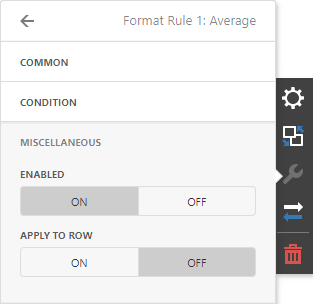
Grid-Specific Format Condition Settings
The format rule’s Miscellaneous section contains the following properties that are specific to the Grid item:
| Option | Description |
|---|---|
| Enabled | Enables/disables the current format rule. |
| Applied to Row | Applies the current format rule to a row. |
Totals
The Grid dashboard item enables you to add a summary value (a total) calculated against displayed values of an individual column, and to show the result under this column. Note that you can add any number of totals for each column. For example, you can obtain the number of column records, average or maximum value, etc.
Totals Overview
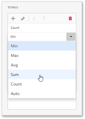
You can use the following summary functions when creating totals.
- Count - The number of records.
-
Sum - The sum of the values.

- Min - The smallest value.
- Max - The largest value.
-
Average - The average of the values.

- Auto - The total is calculated using the type of summary function specified for the measure corresponding to the current Grid column. Note that in this case, the total is calculated based on values of the corresponding data field from the underlying data source.
You can create totals using different sets of summary functions. This depends on the type of the data source field providing data for the target column.
Note that the Auto type is available only for the measure column.
Create and Edit Totals
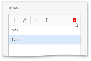
To create a total, open a data item menu and go to the Totals section. Click “+” to add a new total.
To change the total type, open the drop down list and select the required type.
You can delete the required total by clicking the Delete button (the  icon).
Layout
The Grid dashboard item allows you to customize its layout in various ways. You can manage the width of grid columns, specify the visibility of column headers, enable cell merging, etc.
To access the layout settings, use the Layout section in the Grid’s Options menu.
The following settings are available.
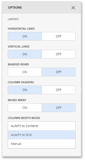
- Horizontal Lines - Specifies grid’s horizontal line visibility.
- Vertical Lines - Specifies grid’s vertical line visibility.
- Banded Rows - Specifies the different background for odd and even rows.
- Column Headers - Allows you to toggle column header visibility.
- Word Wrap - Displays cell content on multiple lines if the size of a dashboard item is insufficient to completely display the cell content on a single line.
- Column Width Mode - Specifies column widths of the entire Grid using one of the available modes.